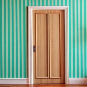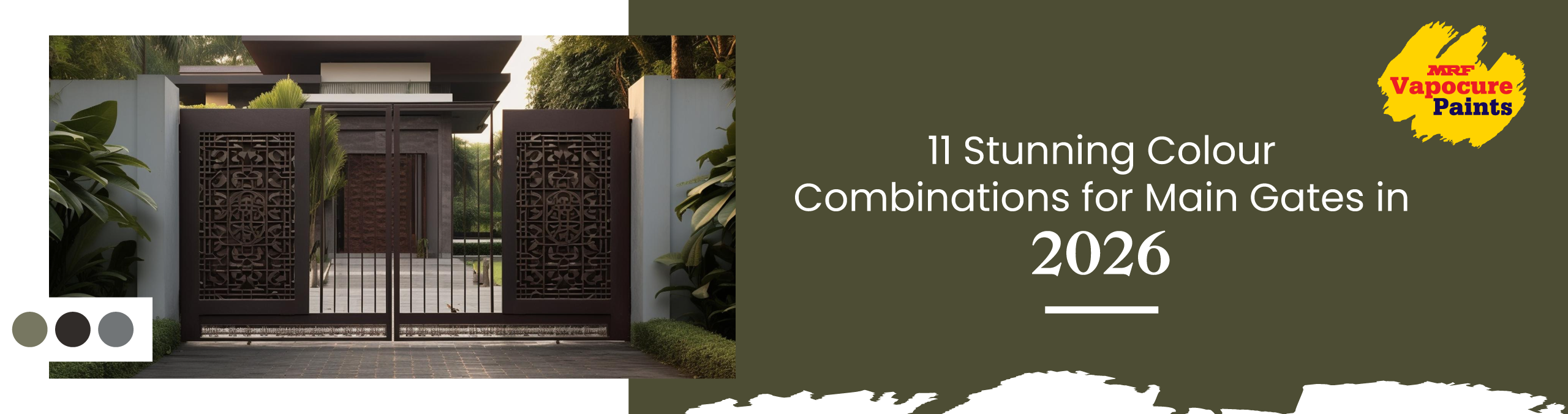
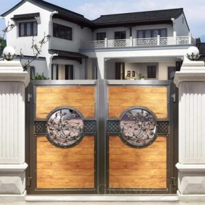
10+ Classy Main Iron Gate Colour Combination for Fornt Gate
Your main gate is the first thing people see when they arrive at your home. It sets the tone before anyone notices the balcony, the balcony plants, or the name board. In 2026, homeowners are moving away from plain, single-shade gates and choosing thoughtful color combinations that match their architecture, lifestyle, and the neighborhood vibe.
The right iron gate colors can
- Frame the facade beautifully.
- Make compact frontage look more premium.
- Reduce the look of dust and stains.
- Support better resale appeal.
Below are 11 stunning color combination for main gates in 2026, along with suggested shades so that you can take these ideas straight to your painter or contractor.
Let’s Begin
Most of us repaint our interiors every few years, but the main iron gate quietly carries on with the same old color. It faces sun, rain, dust, traffic and curious glances all day, yet is usually painted in a hurry with “whatever is available” or a leftover wall shade. Over time, the color fades, touch-ups look patchy, and the gate stops matching the home you have carefully upgraded inside.
Choosing that combination is not just about picking a “nice” color. For Indian homes, you also need to think about dust from the road, direction of sunlight, nearby trees, type of tiles or stone at the entrance and how much time you can realistically spend on maintenance. A thoughtful pair of shades can work with all these conditions.
This blog brings you 11 main iron gate color combination ideas curated for 2026, with clear examples of when each one works best, so that you can move from shortlisting on screen to an exact paint choice on site without guesswork.
Things To Keep In Mind Before You Pick A Gate Color
Before you fall in love with a combination on Pinterest or Instagram, pause and check:
- Architecture style
Modern homes sit well with greys, charcoal, deep blues and clean neutrals. More traditional or heritage façades suit greens, browns, maroons and metallic highlights. - Direction and climate
South- and west-facing gates receive more sunlight and tend to fade faster. Coastal locations pick up more salt deposits. Deeper colors with good UV resistance work better here. - Maintenance level
If your gate faces a main road, darker mid-tones and slightly textured finishes disguise dust better than flat white or very pale colors.
Once you have this context, you can pick a combination that looks beautiful on day one and remains practically all year.
11 Stunning Color Combinations for Main Gates In 2026
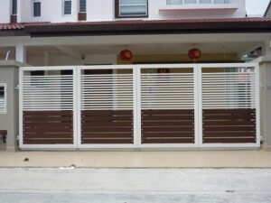
1. Charcoal grey and warm white for a clean, modern look
Charcoal and warm white work beautifully in today’s apartments and independent houses, with simple lines and straight grilles. The darker tone hides everyday dust from the main road, while the lighter highlights keep the entrance looking bright and neat. This combination suits painted compound walls, simple tiles and even granite cladding, so it blends well in most Indian streets.
Why it works in 2026
- Grey keeps the design sophisticated without feeling too harsh.
- Warm white highlights make the gate stand out in photos and in low light.
- The contrast stays sharp even after some dust settles.
It looks especially good against off-white or very pale grey compound walls, and pairs beautifully with potted greens at the entrance.
2. Deep blue and brushed gold for quiet luxury
Deep blue with soft gold detailing is a good choice if you want your gate to look rich without being flashy. In the daytime, the blue feels solid and dignified; at night, the gold picks up the glow from gate lights and streetlamps. This pairing works well for larger family homes where the gate needs to look premium from the outside and still match traditional wooden doors or metal railings.
Why it works in 2026
- Dark blues feel rich and grow up while still being welcoming.
- Gold detailing catches sunlight during the day and warm light at night.
- The combination suits both modern and slightly classical homes.
This pairing looks stunning with cream facades, stone cladding and warm outdoor lights.
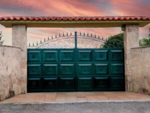
3. Forest green and near black for a heritage feel
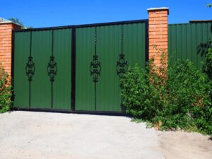
Forest green with a near-black outline is ideal for older houses, corner plots, and homes with trees or garden space in front. The green sits naturally against plants, lawns and roadside avenue trees, so the gate never looks too harsh. The darker frame gives a neat border to the design and helps the gate look solid and secure from the street.
Why it works in 2026
- Green connects visually with plants, lawns and roadside trees.
- Near black frames the gate neatly without looking flat or industrial.
- The palette looks classy with tiled roofs, exposed brick and stone.
Add planters or creepers near the gate to reinforce the garden feel and tie the colors together.
4. Teal and soft grey for a fresh, design-forward entrance
Teal with soft grey is a good option if your home is newly built or has a contemporary elevation with glass, straight grills or Jali work. The teal adds a fresh pop of color that stands out from typical browns and blacks, while grey keeps the overall look calm and balanced. This works especially well in gated communities where many houses look similar, and you still want a subtle point of difference.
Why it works in 2026
- Teal feels more unique than standard green or blue.
- Soft grey balances the brightness and adds maturity.
- The palette works beautifully with white walls, concrete textures and minimalist landscapes.
If your home leans slightly coastal or resort-style, this combination fits perfectly.
5. Rust and coffee brown for an industrial, earthy statement
Rust and deep brown suit homes that face busy roads, commercial stretches or areas with more dust and traffic. The earthy tones hide small scratches, hand marks and mud splashes better than very light colors. This combination pairs nicely with brickwork, stone cladding, and darker floor tiles often used outside Indian homes.
Why it works in 2026
- Earthy rust tones are on trend in architecture and landscaping.
- Brown grounds the palette and keeps it from feeling too loud.
- The combination hides dust and minor scratches effectively.
This works well on streets with a lot of traffic or construction dust, where white or very dark colors would be tough to maintain.
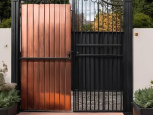
6. White and wood-inspired brown for a classic villa façade
Soft white with a wood-inspired brown works well for homes that already have wooden main doors, balcony railings or window frames. The white keeps the frontage looking bright and welcoming, especially in narrower streets, while the wood tone adds warmth without the upkeep of real timber. This is a safe choice if you host guests often and want the entrance to look tidy in photos and in person.
Why it works in 2026
- White keeps the entrance bright and airy.
- Wood tones give a sense of warmth and homeliness without real timber maintenance.
- The look pairs well with balconies, pergolas and tiled roofs.
Perfect if you are going for a European villa or premium township vibe.
7. Olive green and beige for a calm, nature-inspired gate
Olive green with beige detailing is a gentle, nature-friendly palette that suits homes with plants, creepers and potted trees near the entrance. The colors blend nicely with both painted compound walls and stone pillars, so the gate doesn’t fight for attention. It is a good option for residential layouts where you prefer a softer, more peaceful look from the road.
Why it works in 2026
- Olive is trending as a sophisticated alternative to bright green.
- Beige softens the palette and blends with stone, tiles and neutral façade.s
- The combination feels grounded and works across seasons.
Add a simple nameplate and warm white gate lights to complete the look without clutter.
8. Graphite grey and silver for sleek, high-rise entrances
Graphite grey and silver work very well for compact plots, duplex houses and builder floors where the front space is limited. The darker grey makes the gate look sturdy, while the silver lines and handles add a clean, finished touch that shows up nicely under LED gate lights. This combination also matches easily with standard balcony rail shades and window grills used in many Indian projects.
Why it works in 2026
- Metallic-inspired palettes echo modern cars, fixtures and railings.
- Grey hides day-to-day dust better than pure black.
- Silver highlights add just enough sparkle without feeling flashy.
This works very well when your balcony railings, window grills and main door hardware already use similar tones.
9. Brick red and near black for bold street presence
Brick red with near-black detailing gives an intense look that many families prefer for main-road-facing properties. The red complements brick walls, Mangalore tiles, and terracotta pots, while the black outline reinforces a sense of safety. This palette is also practical in areas with frequent vehicle movement, where lighter colors can quickly start to look dirty.
Why it works in 2026
- Brick red hints at traditional materials yet feels bold and urban.
- The dark outline strengthens the silhouette of the gate.
- The palette pairs naturally with brick walls, terracotta tiles and earthy plants.
Add a simple brass nameplate or house number to soften the overall feel.
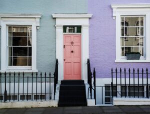
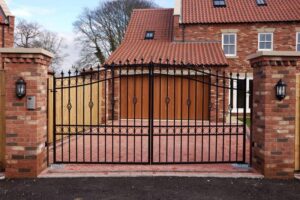
10. Navy and off-white for a refined, colonial touch
Navy and off-white suit homes with small arches, simple pillars or slightly traditional balcony designs. The navy gives the gate a formal, well-kept look, and the off-white borders or motifs keep it from feeling too heavy. This combination works nicely in older neighborhoods and coastal cities where you want the gate to look bright but still friendly.
Why it works in 2026
- Navy feels distinguished and photographs well at any time of day.
- Off-white detailing looks crisp against both light and dark boundary walls.
- The combination suits coastal cities and older neighborhoods with character.
Pair this with warm outdoor lighting, planters and a simple wooden or solid main door.
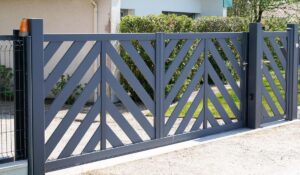
11. Layered greys for a subtle, designer gate
Using two greys from the same family is a good idea if you want a neat, modern gate without too much contrast. A darker grey on the outer frame and a slightly lighter grey on the inside grills give quite depth, especially on compact frontages. It’s easy to maintain, pairs well with almost any exterior wall color, and works well in apartment entrances and independent houses alike.
Why it works in 2026
- Layering tones of one color feels very contemporary
- Greys work across almost any façade color and stone finish
- Small scratches or touch-ups are less noticeable compared to flat black
This is a good option for gated communities with guidelines on façade colors, where you still want your home to look a little more polished.
Stronger Protection for Your Main Gate
MRF Vapocure Paints focuses on making strong, reliable finishes for real Indian homes. Our metal paints for main gates are designed to handle harsh sun, heavy rain, dust and daily movement without giving up easily. With proper surface preparation and priming, they form a tough film that helps protect the iron from rust, peeling and early fading. The surface stays smoother for longer, so regular cleaning and small knocks do not spoil the look quickly. For your main iron gate, this means your chosen color combination can continue to look neat, secure and well cared for through many seasons
Summing Up
Once you have chosen a combination you like, talk to your painter or contractor about:
- Surface preparation for iron gates
- Suitable Primers for exterior metal
- The right topcoat from our systems for weather resistance and gloss or sheen level you prefer
Screens will never show colors exactly as they appear in real life, so always check a physical shade card or a sample panel at the site before finalizing.
Pick the combination that fits your home, your street and your routine, then let a high-quality exterior metal coating do the rest. Your main gate will not only look stunning in 2026, but it will also stand up better to the sun, rain and daily use for years to come.
FAQs on Main Iron Gate Color Combinations
1. What should I check before deciding on my primary gate colors?
Before you open a shade card, stand outside your house and notice:
- The color of the compound wall and elevation
- The direction your gate faces and how much hard sunlight it receives
- The type of road in front: quiet street, main road, service lane
- Existing window grills, balcony railings and main door finishes
Make a quick note of two or three colors that already dominate the frontage, such as off-white walls with brown grills, or cream walls with grey railings. Your gate combination should either sit in the same family or give a controlled contrast. When you start from what already exists instead of a random reference image, the final result looks more intentional and less like a mismatch.
2. Is it better to choose dark or light colors for an iron gate?
Both can work, but they behave differently in real conditions:
- Darker colors
Hide dust, minor scratches and welding marks better. Suitable for main roads, busy areas and houses near markets or bus routes. - Lighter colors
Make a narrow frontage look more open and airier. Better for internal streets, north-facing homes and plots with less dust.
A practical approach is to keep the main structure in a mid to deep shade and use lighter tones only as accents or borders. This gives you the advantage of easy maintenance without making the gate look heavy.
3. Should my gate match the compound wall and main door?
They do not have to be identical, but they must look like they belong to the same house. You can use these simple rules:
- If the compound wall is light, choose a slightly deeper gate so it stands out neatly.
- If the wall already has stone cladding or tiles, pick a gate shade that appears in those materials or complements them.
- If your main door is wood, having at least one warm tone in the gate (wood-inspired brown, rust, brick red) keeps the front view connected.
Avoid using more than three strong colors on the front elevation, including wall, gate and doors. Too many unrelated shades can make the house look crowded, even if each color is good on its own.
4. How do I choose a gate color combination that still looks relevant after a few years?
Trends change, but some combinations age better than others. To keep your gate looking current for longer:
- Use classic neutrals like grey, brown, cream or off-white as the base.
- Bring trendy colors in small, controlled areas, not the entire gate.
- Avoid very sharp or neon shades on large surfaces. They are eye-catching initially but can feel dated quickly.
- Check how the combination looks in morning sun, afternoon light and evening artificial light before finalizing.
If you are unsure, pick a pairing where one color feels familiar and proven for exteriors, and the second color adds a fresh touch.
5. How often should I repaint my iron gate, and what affects this?
In many Indian homes, a properly prepared and painted iron gate can look decent for about four to six years. However, you may need attention sooner if:
- The gate faces the harsh Western sun.
- You live near the sea, industrial areas or heavy traffic.
- The previous painting was done without a proper metal primer or surface cleaning.
To extend the life of your gate finish, ask your painter to:
- Remove loose rust and old flaking paint.
- Apply a good-quality metal primer suited for exterior conditions.
- Use a topcoat designed for metal, not just any leftover wall paint.
Small touch-ups on corners, hinges and latch areas every couple of years can delay full repaint and keep the gate looking well cared for.