The 60-30-10 Rule: Finding the Perfect Two-Colour Combination for Room Walls
Expertise Summary
Choosing two wall colours for a room often goes wrong, not because the shades themselves clash, but because the proportions are uneven. The 60-30-10 rule offers a simple framework borrowed from interior design practice, helping homeowners decide how much of each colour to use so the final result feels balanced rather than chaotic.
Summary
Ever picked two colours you loved individually, only to find the room looking off once painted? The issue is usually proportion, not the shades themselves. In this blog, let us look at how the 60-30-10 rule works, why it helps avoid common wall colour mistakes, and a few combinations that apply this principle effectively.
Finding Harmony Between Two Wall Colours
It happens more often than people expect. A homeowner picks a striking blue and a soft green, both lovely on their own, paints one wall each, and somehow the room feels unbalanced once it is done.
The shades were not the problem. The proportion was.
This is where the 60-30-10 rule comes in, a method originally used in broader interior design and decorating circles, now applied just as usefully to wall colour planning.
What Exactly Is the 60-30-10 Rule?
The idea is straightforward. Sixty per cent of a space should carry a dominant colour, thirty percent a secondary supporting shade, and the remaining ten per cent reserved for accent elements.
Applied to walls specifically, this usually translates to one colour covering the majority of the room (three walls, or the larger expanse), while the second shade is used on a single feature wall or a smaller section. The ten percent then comes through in decor, cushions, artwork, or trim, not necessarily paint at all.
Why Proportion Matters More Than People Realise
When two strong colours are split roughly fifty-fifty across a room, the eye does not know where to settle. Neither shade gets to lead, and the space can start to feel busy rather than considered.
Giving one colour clear dominance allows the second shade to function as a highlight rather than as competition. This is particularly useful in smaller rooms, where too many competing tones can make the space feel cramped.
Did You Know?
Lighter dominant shades tend to make rooms feel larger and airier, while a deeper accent wall in the remaining thirty percent adds depth without overwhelming the space. This balance is part of why the 60-30-10 approach works so consistently across different room sizes.
| Poll: How Do You Usually Pick Wall Colours for a Room? 🔘 I choose colours I personally like it, regardless of proportion |
A Few Combinations That Apply the Rule Well
1. Monet Blue with Soulful Green
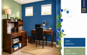
A confident, saturated blue as the dominant tone, paired with a softer, muted green as the secondary shade, creates a combination that feels composed rather than busy. The blue carries enough weight to lead the room, while the green keeps the overall palette from feeling too cool or stark.
2. Pumped Up Pink with Trendy Lilac
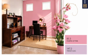
A warm pink used as the dominant colour, balanced with a quieter lilac in the secondary share, creates a gentle, comforting combination. Keeping pink as the larger presence and lilac as the supporting tone stops the pairing from feeling overly sweet or one-note.
3. Row Your Boat Blue with Glazed Apricot
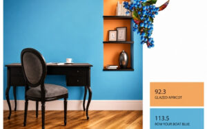
A bright sky blue set against a soft peachy apricot brings energy to a palette while still reading as cohesive since both shades sit on the lighter, brighter end of the spectrum. Apricot, as the smaller accent share, keeps the combination playful rather than overwhelming.
| Did You Know? Choosing the right colour combination is only part of the equation. The paint finish plays an equally important role in how the colours appear once applied. For homeowners looking to create elegant two-colour wall designs, premium interior finishes such as RUCA Luxury Emulsion can help bring out the depth, richness, and character of the selected shades. |
4. Porch Candle with Bay Leaf
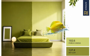
Both shades sit within the same green family but differ in intensity, which makes this pairing easy to balance. Using the lighter porch-candle tone as the dominant colour and the deeper bay leaf as the accent introduces depth without bringing in an entirely different hue.
| While proportion helps create visual balance, the colours themselves shape how a room is experienced. Learning about colour psychology for interiors can help you choose shades that align with the mood and function of your space, whether you are designing a calming bedroom, a productive home office, or a welcoming living room. |
5. Quartzite Gold with Gray Nuance
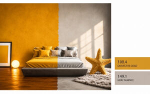
A rich, warm gold paired with a cool, neutral grey creates contrast that still feels grounded, since the grey tones down the intensity of the gold rather than competing with it. This combination works well for homeowners who want warmth without it tipping into something too traditional or heavy.
How to Decide Which Colour Should Dominate
A useful starting point is considering the room’s natural light. Rooms with strong daylight can usually carry a deeper dominant colour without feeling closed in, while darker or smaller rooms often benefit from a lighter shade taking the sixty percent share.
It also helps to think about furniture and flooring already in the room. The dominant wall colour should generally work with existing wood tones or upholstery, while the secondary shade has more flexibility to introduce contrast.
Applying the Rule Practically at Home
In most homes, the rule works out to painting three walls (or the larger continuous wall area) in the dominant shade, with one feature wall, often behind a bed, sofa, or desk, carrying the secondary colour.
For the remaining accent portion, this does not need to come from paint at all. A patterned cushion, a piece of artwork, or even curtain fabric can introduce that final ten percent without requiring another tin of paint.
Creating Spaces That Look Balanced and Feel Inviting
For decades, MRF Vapocure Paints has been helping homeowners bring their spaces to life with colours that balance style, durability, and everyday practicality. From timeless neutrals to contemporary palettes, our carefully curated shades are designed to suit every room and every personality. If you are exploring options beyond colour selection, MRF Vapocure Paints also offers a wide range of interior paint solutions designed to complement different design preferences and performance requirements.
For households seeking advanced protection alongside premium appearance, AquaFresh Interior offers water-based polyurethane technology that delivers a silky finish with excellent stain resistance and scrub durability. Its low-odour formulation and superior washability make it a practical choice for family spaces, children’s rooms, and high-traffic areas where walls are cleaned frequently.
Summing Up
A wall colour combination rarely fails because of poor taste. More often, it fails because two shades were given equal weight when one needed to lead. The 60-30-10 rule offers a simple way to think through that balance before any paint goes on the wall.
Whether the preference is a calm green and blue study, a warm gold and grey living room, or a playful teal and lime accent wall, applying this proportion consistently tends to produce a far more settled, intentional result than guessing shade pairings at random.
FAQs
1. What is the 60-30-10 rule in interior painting?
It is a proportion guideline where sixty percent of a room uses a dominant colour, thirty percent a secondary shade, and ten percent comes through accents.
2. Can the 60-30-10 rule be applied using only paint?
Yes, you can do the whole thing in paint if you want; there’s nothing stopping you from using three shades of paint. This usually shows up on trim, a door, a window frame, or a small architectural detail, rather than another full wall, so it stays in proportion with the other two colours.
3. Which wall should carry the secondary colour?
Typically, a feature wall, such as the one behind a bed, sofa, or desk, works well for the secondary thirty percent shade.
4. Does this rule work for small rooms, too?
Yes. In fact, smaller rooms often benefit more from clear proportions, as competing colours in equal measure can make limited space feel cluttered.
5. How do I choose a dominant colour for my room?
Consider the room’s natural light, existing furniture tones, and the overall mood desired before selecting the dominant shade.
6. Can I use three different colours instead of two?
The rule traditionally uses three elements (dominant, secondary, and accent), though the third is often introduced through decor rather than a third paint colour.
7. Are darker dominant colours a bad idea?
Not necessarily, particularly in well-lit rooms. Darker dominant shades can work well when paired with a lighter secondary tone for balance.
8. Which combination works best for a home office?
Cooler, focused tones like blue paired with green tend to suit work-orientated spaces, helping maintain a calm, concentrated mood.
9. Should the secondary colour always be lighter than the dominant one?
Not always. What matters more is contrast and balance, rather than one shade strictly being lighter or darker.
10. Can this rule help if I am unsure about combining colours?
Yes. Following a set proportion removes much of the guesswork involved in deciding how two colours will work together in a room.