Colours That Bring Warmth and Light to Your Home This Monsoon
Grey skies have a way of flattening even a well-decorated home, and the usual fix, waiting for better weather, is not really a fix at all. This blog looks at colours built to hold warmth and light through the dullest days of the season, along with how to test and apply them properly.
Quick Read and Key Takeaways
Warm, golden and honeyed neutrals hold their glow far better than cool whites or greys once monsoon light sets in, since they carry undertones that do not depend on strong sun to read as inviting. Choosing a palette with the greyest days in mind, rather than the sunniest ones, keeps a home feeling lit through the entire season.
- Cool undertones lose most of their warmth under overcast light, while warm, golden undertones hold their character.
- A colour that looks bright in a showroom can look completely different once tested under real grey skies at home.
- Warm honey, wheat, parchment, amber and gold-toned neutrals are especially forgiving through long stretches of low light.
- Reflectivity matters as much as undertone, since a slightly warmer finish can help a room bounce back what little light does come through.
- Testing a shortlisted colour specifically on an overcast day gives a more honest result than testing it on a bright afternoon.
- A single warm accent wall can lift an entire room without needing every wall to carry a bold colour.
Chasing Light Indoors When the Sky Won’t Cooperate
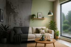
A home does not stop needing light just because the sky has stopped providing much of it. Long, grey stretches during the monsoon test a colour palette in a way sunny afternoons never do, and shades that look perfectly fine most of the year can suddenly feel flat, cold or simply tired. This blog looks at colours that genuinely hold warmth and light through those long grey days, not by fighting the weather, but by working with the kind of light a monsoon actually provides.
What Makes a Colour Read as Warm and Lit Indoors
Undertone Versus Actual Colour
Two shades can look almost identical on a paint chip and behave completely differently once painted, purely because of what lies underneath the visible colour. A white with a cool, blue-leaning undertone reads as flat and clinical under grey skies, while a white with a warm, honeyed undertone continues to glow even with very little natural light reaching it.
Reflectivity and How a Room Bounces Light
Beyond undertone, how much light a finish reflects also shapes how bright a room feels. A slightly warmer, higher reflectivity finish helps a room make the most of limited daylight, bouncing what little comes through rather than absorbing it into a flat, matte surface.
Did You Know? A room painted in a warm, light-reflecting shade can feel noticeably brighter than an identically lit room painted in a cool, low-reflectivity colour, even when both receive exactly the same amount of natural light.
Why Warmth Matters More During the Monsoon Than Any Other Season
The Emotional Weight of a Grey Stretch
Weeks of overcast weather affect more than just how a room looks; they affect how a space feels to spend time in. A living room that glows gently, even faintly, tends to feel more welcoming during a long rainy stretch than one that reads as flat and grey to match the sky outside.
The Clutter No One Plans For
There is also the part of the monsoon nobody puts on a mood board. Clothes that would normally dry outside within an hour end up draped over the backs of chairs, hung on a makeshift line strung across the balcony door, or looped over hangers dangling straight under the ceiling fan because there is simply nowhere else for them to go. A home that usually looks put together suddenly carries a slightly different atmosphere, a little more humid, a little more cluttered, entirely out of anyone’s control. Walls cannot fix a room full of drying laundry, but a warm, glowing colour can stop that same room from feeling doubly grey, once from the sky outside and again from everything hanging indoors because of it.
Why Sunny Season Colour Choices Often Fail in the Monsoon
Many colour decisions get made during the brightest part of the year, when strong sun makes almost any shade look good. Those same colours are rarely tested against weeks of low, grey light, or against a room quietly rearranging itself around drying clothes and closed windows, which is exactly when a home most needs a palette that can hold its own.
The Colours That Bring Warmth and Light to a Home This Monsoon
Honey Pot
A soft, golden honey tone that carries real warmth without tipping into a bold, saturated colour. It works particularly well in living areas and hallways, giving a gentle glow that makes a strong first impression on a grey day.
Winter Wheat
A warm, sandy neutral that sits comfortably between beige and tan. Winter Wheat holds its warmth evenly across large wall areas, making it a dependable choice for bedrooms and other rooms that need to feel calm rather than dramatic.
Parchment Paper
A pale, warm cream that reads as bright without the flat, clinical look a pure white can take on under grey skies. It suits rooms that rely heavily on daylight, since it reflects what light there is rather than absorbing it.
Amber Glow
A muted, warm neutral with just enough amber undertone to feel lit from within, even in a room with limited natural light. It pairs well with wood furniture and warm metal fittings, tying a room together without needing a second accent colour.
Quartzite Gold
A richer, more confident gold, best used as an accent rather than across an entire room. A single Quartzite Gold wall, paired with a calmer neutral for the rest of the space, adds warmth exactly at the spot a room needs it most. Our earlier guide on the 60 30 10 rule for wall colour covers pairing a bolder shade like this one with a calmer base in the right proportion.
| Shade | Best Used In | Character |
| Honey Pot | Living areas, hallways | Soft golden warmth, gentle glow |
| Winter Wheat | Bedrooms, calm spaces | Even, sandy neutral |
| Parchment Paper | Daylight-dependent rooms | Bright without feeling clinical |
| Amber Glow | Living rooms with wood furniture | Muted warmth, ties a room together |
| Quartzite Gold | Single accent wall | Confident, best used sparingly |
How to Test and Apply These Colours Properly
Testing Specifically on an Overcast Day
Paint a test patch of each shortlisted colour directly on the wall and check it specifically during a stretch of grey weather, not just on a bright afternoon. A shade that only performs well in full sun is not one built to carry a home through an entire season of low light.
Pairing Warm Neutrals with Existing Furniture
Warm neutrals generally sit well against both light and dark wood furniture, though it helps to hold a sample against existing pieces before committing, since undertones can clash in ways that are hard to predict from a chip alone.
Interior Finishes Built to Hold Their Warmth
MRF Vapocure Paints has spent decades developing interior finishes suited to homes through every kind of light, not just the brightest months of the year. For living spaces needing a richer, more considered finish, RUCA Luxury Emulsion holds onto the depth of a warm shade regardless of how much daylight actually reaches the room. For kitchens, bathrooms and other high-traffic spaces that need to stay warm and fresh-looking through humid months, AquaFresh Interior offers a washable, low odour finish built for frequent cleaning without losing its glow.
Conclusion
A home does not need to wait for sunnier days to feel warm and lit. Honey Pot, Winter Wheat, Parchment Paper, Amber Glow and Quartzite Gold each hold their character through long stretches of grey weather, provided they are tested honestly, on an overcast day, against the room they will actually live in. Choosing warmth on purpose, rather than hoping the sun does the work, keeps a home feeling alive through the entire monsoon rather than just the clear days in between.
Frequently Asked Questions
- What colours bring the most warmth to a home during the monsoon?
Warm, golden neutrals such as honey, wheat, parchment and amber tones tend to hold their warmth best under grey, overcast skies.
- Why do some colours look duller than others under monsoon light?
It comes down to undertone. Cool, blue-leaning shades lose their warmth quickly under overcast light, while warm undertones hold their character.
- How do I test a colour for how it will look during the monsoon?
Paint a test patch directly on the wall and check it specifically during a stretch of grey, overcast weather rather than on a bright day.
- When is the best time to repaint a home for the monsoon season?
Ideally during a dry, stable stretch of weather before the rains set in, since this gives paint the best conditions to dry and cure fully.
- Who benefits most from choosing a warmer interior palette?
Homes with limited natural light, north-facing rooms, and households that spend long hours indoors during the rainy months benefit the most.
- Which rooms should get warmer colours first if I can’t repaint the whole house?
Living rooms and other shared, frequently used spaces benefit the most from a warm palette, since these rooms carry the mood of a grey day most directly.
- Does a warm colour palette work well with existing wood furniture?
Yes, warm neutrals generally pair well with both light and dark wood tones, though it helps to test a sample against the actual furniture first.
- Can I use a bold shade like a warm gold without overwhelming a room?
Yes, provided it is used as a single accent wall against a calmer neutral base, rather than across the entire room.
- Is it necessary to repaint an entire home to fix monsoon dullness?
No, refreshing just the most used rooms, typically living areas or spaces with limited natural light, often makes a noticeable difference on its own.
- Do warmer colours need a different paint finish compared to cooler ones?
Not necessarily, though a finish with slightly higher reflectivity can help a warm colour make the most of limited natural light in darker rooms.