Best Exterior Wall Colour Combinations for a Stylish and Welcoming Home
Choosing the right wall colour is like setting the mood for your home — one wrong shade can dull the whole look. But when colours connect with light, space, and feeling, the house instantly comes alive and feels complete. A good rule to start with is the 60:30:10 rule — 60% for the main wall colour, 30% for the secondary tone, and 10% for the highlight or accent.
Let’s Begin
Ah, we’ve all heard how a background sound or piece of music can completely change the vibe and pulse of a video, right? In the same way, interior and exterior wall paints can do wonders for your home, or completely dull its charm if not chosen right. Do you agree?
Now, when it comes to interiors, you can experiment or pick shades you personally love — maybe keep it neutral, maybe go bold. But exterior wall colours? That’s where it gets a bit tricky. If it’s too loud, the house might look overdone. Too plain, and it ends up looking flat and lifeless.
So, how do you find that balance? How do you choose your exterior wall colours, and what are some of the best, classic combinations that look elegant yet trendy? You know what to do — scroll till the end!
20 Stylish Exterior Wall Colour Combinations You’ll Love
Contemporary Homes
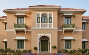
When you are choosing colours for a contemporary home, the first question is not “What looks modern?” but “What feels balanced?” Contemporary design is built on clarity and comfort working together. It values space, proportion, and light. Your exterior palette should mirror that calm order while still reflecting your individuality.
1. Ivory and Olive Gray with Wooden Accents
This combination gives the exterior a sense of openness and warmth. The ivory base keeps the walls bright and reflective, allowing natural light to move freely. Olive gray brings a quiet sense of structure, defining the design without making it heavy. A few wooden details on the doors or window frames create a gentle balance between sophistication and nature. It is a palette for people who like modern living but prefer warmth over starkness, and character over shine.
MRF Vapocure Paints shades: Ivory Lace, Realistic Gray, Biscotti Brown
2. Cool Beige and Deep Graphite with Bronze Highlights
This combination brings a more defined and confident look. Cool beige has a neutral softness that calms the facade, while deep graphite adds depth and focus. When paired with subtle bronze accents on the railings or light fittings, the home gains a fine layer of refinement. The balance between these tones creates a space that feels modern yet timeless, structured yet approachable. It is an ideal choice for those who prefer elegance without extravagance and clarity without coldness.
MRF Vapocure Paints shades: Leaning Tower Beige, Gunmetal Gray, Bronzed Gold
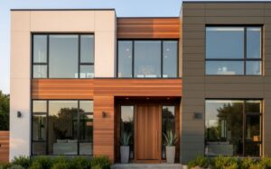
Modern Minimalist Homes
Choosing colours for a minimalist home is less about decoration and more about discipline. Minimalism celebrates light, proportion, and clean geometry. It requires restraint, but also an understanding of how subtle changes in tone can shape a mood. The exterior should look simple at first glance, yet reveal depth when observed closely.
3. Ash Gray, Off-White and Black Trim
This palette works beautifully for homes that rely on straight lines and large open walls. The off-white keeps the structure bright and neutral, creating a clean canvas for architectural features. Ash gray adds a shadowed contrast that softens the sunlight and gives the surface quiet depth. Black trims around windows and edges create a clear definition without drawing attention away from the form. The result is a home that feels composed, calm, and effortlessly modern.
MRF Vapocure Paints shades: Gray Skies, Original Off White, Raven
4. Muted Sand, Stone Gray and Matte Black
Muted sand offers warmth while remaining understated. It prevents the home from looking too cold, especially when paired with the cool undertone of stone gray. Matte black elements such as frames, doors, or railings introduce a sense of stability and refinement. Together, the three tones form a grounded palette that feels balanced and quietly sophisticated. This is the kind of exterior that looks modern without trying to impress, and timeless without appearing old.
MRF Vapocure Paints shades: Spiaggia Sand, Minerva Gray, Obscure Licorice
Traditional or Heritage Homes
Traditional homes often carry a sense of continuity, linking present comfort with the charm of the past. The right exterior colours preserve that feeling of belonging while keeping the structure alive and graceful. Warm, earthy tones work well here because they respond beautifully to sunlight and age with character.
5. Terracotta, Cream and Brown Accents
Terracotta has an enduring quality that makes a home feel familiar and welcoming. It captures warmth during the day and softens beautifully in the evening light. Cream tones help to lift the heaviness of the terracotta, adding balance and brightness. Brown details on doors, pillars, or trims complete the picture by giving subtle definition. This combination works best for homes with verandas, balconies, or extended rooflines. It evokes comfort, permanence, and a sense of quiet pride.
MRF Vapocure Paints shades: Zanzibar Rust, Italian Cream, Gourmet Chocolate
6. Mustard Yellow, White and Olive Green
Mustard yellow carries an energy that brightens the exterior while still maintaining a sense of tradition. When paired with crisp white edges, the contrast becomes lively yet balanced. Olive green, used on doors or railings, introduces a natural accent that grounds the brightness. The palette feels cheerful without being loud and brings personality to the facade. It suits homes that want to appear welcoming and full of life while keeping a classic charm.
MRF Vapocure Paints shades: Daring Mustard, Uffizi Gallery White, Olive Green
Mediterranean or Villa Style Homes
Mediterranean and villa-style homes are built to celebrate sunlight, open courtyards, and relaxed spaces. The colour combinations here should feel bright yet grounded, reflecting the easy pulse of outdoor living. These homes often feature soft curves and wide windows, which respond best to warm, natural shades that catch the light beautifully.
7. Sand Beige, Sea Green and White Trim
Sand beige forms a calm and sunny base that reflects natural warmth. Sea green adds a touch of coolness, giving the home a sense of freshness and airiness. The white trims around pillars, windows, and arches create clean boundaries that highlight the structure without overwhelming it. Together, these colours bring a coastal ease to the exterior. They work exceptionally well in spaces with strong sunlight, where softer tones keep the design open and breezy. The combination makes the home feel both elegant and restful.
MRF Vapocure Paints shades: Leaning Tower Beige, Seafoam Green, Happy Hour White
8. Ivory, Coral Peach and Olive Accents
Ivory gives the walls a timeless softness, while coral peach introduces a hint of optimism. The gentle pink-orange tone brightens the facade without feeling excessive. Olive accents on doors, balcony railings, or trims add depth and help tie the palette back to the natural surroundings. This combination suits homes that want to capture warmth and personality but remain tasteful and composed. It is expressive but never loud, simple but never dull. The house ends up looking welcoming in every kind of light, from morning glow to evening shade.
MRF Vapocure Paints shades: Iconic Ivory, Smooth Peach, Cerignola Olive
Industrial Modern Homes
Industrial modern design celebrates structure, texture, and honesty in materials. The exterior colours for this style should reinforce that sense of strength while keeping the home approachable. The look is modern but not sterile, straightforward but not harsh.
9. Graphite Gray, Concrete Tone and Rust Brown
Graphite gray provides the foundation, giving the exterior a deep and confident appearance. The lighter concrete tone adds a middle layer that prevents the design from becoming too heavy. Rust brown works as a warm counterpoint, offering a hint of colour that brings humanity into an otherwise cool palette. This combination reflects durability and character. It suits homes that want a clean, modern outline but still express a sense of life and use.
MRF Vapocure Paints shades: Gunmetal Gray, Cinder Block, Umber Brown
10. Off-White, Iron Gray and Brick Red
Off-white keeps the facade open and bright, balancing the density of iron gray. The inclusion of brick red on smaller elements, such as borders or railings, gives a deliberate accent of warmth. The result is a structure that feels stable and strong yet remains approachable. This palette works well for houses that have sharp geometry or mixed materials like glass and metal. It looks balanced, deliberate, and quietly confident.
MRF Vapocure Paints shades: Original Off White, Armor Gray, Wild West Red
Rustic or Country-Style Homes
Rustic homes are built around warmth and belonging. The colours that suit them are those we often see in nature: soft browns, greens, and beiges that feel familiar even at first glance. These homes look their best when the walls reflect sunlight gently and blend with the surroundings.
11. Warm Beige, Olive Green and Deep Brown
Warm beige gives the home a comfortable base. It keeps the structure bright but never sharp. Olive green adds a connection to the outdoors, reminding us of trees and open space. Deep brown on doors, frames, or railings gives the design depth and weight. When these colours come together, the home feels settled, as if it has been part of the landscape for years. It is a palette that works beautifully in places with plenty of greenery and open light.
MRF Vapocure Paints shades: Sugar Cookie, Palmetto Green, Radcliffe Brown
12. Muted Terracotta, Cream and Sand Beige
Muted terracotta carries the quiet strength of earth. It is friendly, easy to live with, and looks especially good when the light changes throughout the day. Cream lifts the walls just enough to make them fresh, while sand beige helps tone down the contrast. Together, these shades create an exterior that feels steady and warm. This is the kind of home that looks pleasant after rain, soft in the afternoon sun, and calm under evening light.
MRF Vapocure Paints shades: Hat Trick Terra, Cream Cheese, Spiaggia Sand
Fusion or Transitional Homes
Fusion design is for people who like both tradition and modern clarity. It is about balance — keeping the comfort of older styles while adding the simplicity of new ones. The colours should neither look overly decorative nor too plain. They need to show personality while keeping the design refined.
13. Cool Gray, Beige and Teakwood Brown
Cool gray provides modern sharpness, while beige keeps the tone grounded and familiar. Teakwood brown adds that touch of warmth which ties both worlds together. It works especially well for homes that have a mix of straight and curved lines or modern balconies with traditional elements. The overall look feels mature, well-balanced, and quietly stylish.
MRF Vapocure Paints shades: Chance of Rain, Bauhaus Beige, Sumptuous Suede
14. White, Slate Gray and Royal Blue Door
White and slate gray form a clean and simple combination that works for almost any structure. The royal blue door then becomes the accent — the point where the house shows character. It gives the home a pleasant individuality without overwhelming it. This combination looks best when the house gets good natural light and the entrance is meant to be a focal point. It feels organised, welcoming, and slightly playful.
MRF Vapocure Paints shades: Uffizi Gallery White, Cannon Gray, Bold Blue
Eco-Contemporary Homes
Eco-contemporary design focuses on connection rather than contrast. These homes often rely on natural light, open layouts, and materials that breathe. The colours that work best here are the ones that feel organic — tones that you might find in stone, sand, or leaves. The aim is to make the home look like it belongs to its surroundings.
15. Bamboo Beige, Leaf Green and Natural Wood Accents
Bamboo beige brings calmness and an easy warmth that suits almost any climate. Leaf green adds freshness, keeping the home lively without being bright. Natural wood accents on pillars, frames, or railings tie the whole look together. When combined, these shades feel light, balanced, and healthy. The house gives a sense of freshness throughout the day and comfort in the evening. It is perfect for those who like open spaces and want the home to look peaceful but alive.
MRF Vapocure Paints shades: Moorish Cream, Peaceful Green, Biscotti Brown
16. Pebble Gray, Sage Green and Ivory Trim
Pebble gray creates a smooth, neutral surface that goes well with green spaces or gardens. Sage green brings a quiet, natural charm, while ivory trims highlight the edges cleanly. The overall look feels tidy, calm, and refreshing. This combination works especially well for modern structures that rely on natural textures like wood, brick, or concrete. It lets the building breathe and look composed at the same time.
MRF Vapocure Paints shades: Roomy Gray, Sea Cliff Sage, Ivory Lace
Luxury or Urban Villa Homes
Luxury in design is not about brightness or show. It is about proportion, balance, and how light moves across the surface. For large villas or modern homes, the colours need to look rich yet relaxed — graceful during the day and impressive at night.
17. Soft Greige, Burnished Gold and Deep Walnut
Greige, a blend of gray and beige, brings a smooth, sophisticated tone that forms the perfect backdrop for any structure. Burnished gold adds a quiet glow that looks beautiful under evening light, and deep walnut introduces warmth that keeps the design from feeling too cold. Together, they create a sense of depth and quiet refinement. This palette works best for homes with broad facades, clear geometry, and a focus on clean finishing. It feels confident, calm, and timeless.
MRF Vapocure Paints shades: Greige Scallop, Bronzed Gold, Brazilian Rosewood
18. Stone White, Charcoal Gray and Cocoa Brown
Stone white brightens the house naturally without the glare of pure white. Charcoal gray outlines the form neatly, giving structure and strength. Cocoa brown, used for the door or panels, adds an earthy contrast that softens the overall look. This combination feels premium but not loud, perfect for families who prefer understated elegance and want their home to age beautifully.
MRF Vapocure Paints shades: White Marble, Dark Knight, Biscotti Brown
Smart Urban or Tech-Integrated Homes
Smart homes are built for function, but they should still look warm and inviting from the outside. The idea is to balance sleek technology with human comfort. The colours for this kind of home should be clean and strong but softened with touches that keep them from feeling mechanical.
19. Charcoal Black, Ice Gray and Lime Accent
Charcoal black gives the structure a modern and confident presence. Ice gray lightens the surface, keeping the design open and balanced. A touch of lime on a border, door, or railing adds freshness and energy. The contrast works best for homes with sharp lines and smooth finishes. It looks smart in daylight and striking under evening lights. The palette suits people who like their homes to look current, neat, and full of life.
MRF Vapocure Paints shades: Raven, Breithorn Gray, Luminous Lime
20. Titanium Gray, Terracotta Rust and Soft Ivory Base
Titanium gray has a clean and steady quality that fits modern design. Terracotta rust adds warmth and personality, preventing the facade from feeling too cold. Soft ivory ties both together and brings in brightness. This mix creates a balanced exterior that feels both high-tech and homely. It works particularly well for duplexes or modern villas where structure and comfort are equally important.
MRF Vapocure Paints shades: Gallery Gray, Zanzibar Rust, Italian Cream
MRF Vapocure Paints: Performance. Protection. Perfection.
MRF Vapocure Paints is a name associated with quality, precision, and trust in surface coatings. Our paints are formulated with advanced technology to provide superior film strength, coverage, and colour retention across interior and exterior applications. We offer an extensive selection of over 18,000 shades, developed to suit every design preference and environmental condition. Each product is tested for performance, ensuring long-term resistance to sunlight, moisture, and surface wear.
Final Reflection
- Colours should match the climate and character: Our homes live through bright sun, dust, rain, and shade. The best exterior shades are those that stay graceful in every season. Choose colours that breathe well and age beautifully, not just ones that look good on a chart.
- Light decides how a colour behaves: In strong daylight, a pale shade can look too bright, and in the evening, the same wall may turn dull. Always test your colours on a small patch and watch how they change through the day before finalising them.
- The surroundings matter: A home near greenery may look better in warm neutral shades, while one in a city lane may need cooler tones to look fresh. Pick colours that blend naturally with your setting rather than fighting against it.
- Balance lasts longer than trend: Every few years, new shades become popular, but a balanced combination that suits your home’s shape and light will never feel outdated. Choose harmony over fashion, and your home will always look timeless.
- A well-chosen palette feels like home: When the colours reflect your lifestyle and the pulse of your space, the house begins to feel lived in and welcoming. It is not about standing out, but about belonging.
FAQs
1. How can I choose the right exterior wall colour for my home?
Notice how much light your house gets and what surrounds it. Pick colours that feel balanced with your space and stay fresh through the year.
2. Which colours work best in hot weather?
Light shades like cream, beige, or off-white reflect heat and keep the home cooler. Add deeper tones like olive or brown for contrast.
3. What colours make a small house look bigger?
Soft neutrals such as light gray or sand beige create an open and airy look. Keeping borders slightly darker adds gentle depth.
4. How often should I repaint my exterior walls?
Every five to six years is ideal, depending on sunlight and rainfall. Homes near the coast may need touch-ups sooner.
5. Should the exterior match the interior?
Not exactly, but the mood should connect. Choose shades that complement each other so the transition feels natural and balanced.