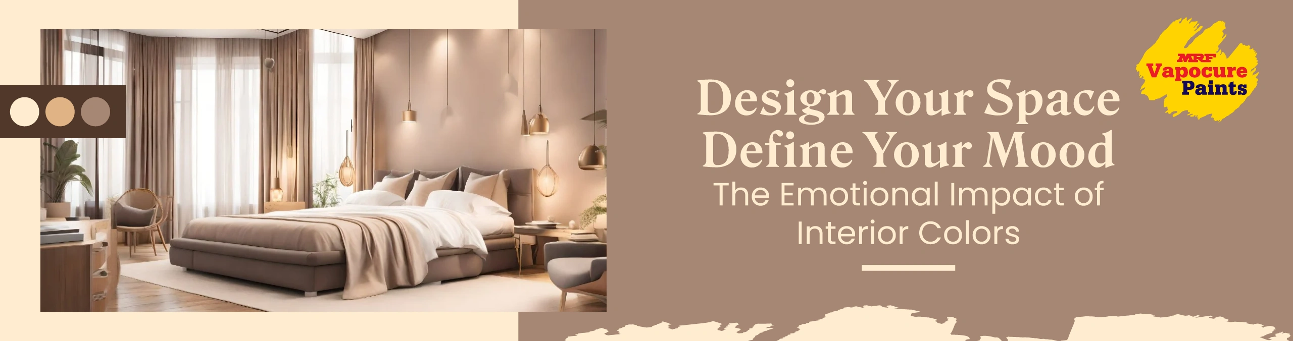
Design Your Space, Define Your Mood: The Emotional Impact Colours psychology for interior
Introduction
Picture entering a room and feeling relaxed, energised or inspired instantaneously. That response is not coincidental, it’s colour’s doing. In colours psychology for Home Interior Colour is more than just something that exists. colours are mood and behavior triggers that affect health as much.
Colour psychology for interior design is the study of colours’ impact on our feelings and beliefs within a space. From calming blues in the bedroom to invigorating yellows in the kitchen, every colour is imbued with psychological meaning. This blog talks about how to assess the emotional impact of colours in interior design psychology to create spaces that reflect your personality and are supportive of your lifestyle.
The Science Behind Colour Psychology
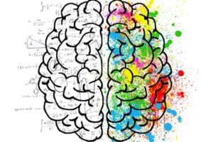
Colour psychology is based on the way our brains process light and wavelength. Warm colours such as red and orange contain shorter wavelengths and are perceived as energising. Cool colours such as blue and green contain longer wavelengths and elicit feelings of calmness.
Within interior design, these connections create environments that:
- Lessen stress
- Increase productivity
- Increase social interaction
- Encourage sleepful sleep
- Stimulate appetite
Knowing the emotional effect of colour enables homeowners and designers to design spaces that are significant and emotionally impactful.
Emotional Effects of Major colours
Following is how major colours affect mood and behavior:
| COLOUR | EMOTIONAL EFFECT | USED BEST IN |
| Blue | Peacefulness, Trust, Calm | Bedrooms, Bathrooms, Offices |
| Red | Passion, Energy, Hunger | Dining rooms, Accent walls |
| Green | Harmony, Renewal, Balance | Living rooms, Home offices |
| Yellow | Creativity, Optimism, Warmth | Kitchens, Playrooms |
| Orange | Sociability, Enthusiasm, Stimulation | Family rooms, Workout areas |
| Purple | Imagination, Luxury, Spirituality | Bedrooms, Meditation rooms |
| White | Simplicity, Openness, Purity | Bathrooms, Minimalist rooms |
| Grey | Sophistication, Neutrality, Peacefulness | Living rooms, Offices, |
| Black | Elegance, Depth, Mystery | Accent walls, Modern interiors |
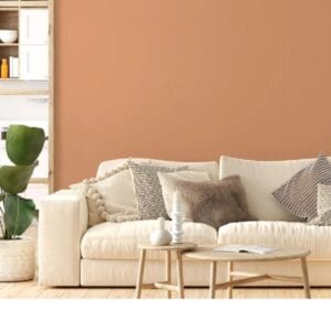
| Brown | Comfort, Stability, Earthiness | Libraries, Dens, Country rooms |
Room-by-Room Colours psychology for interior Psychology Guide
1. Living Room: Social and Inviting
- Recommended Colours: Warm neutrals, muted greens, soft yellows
- Why: Encourages conversation, relaxation and comfort
- Tips: Add depth using accent colours such as terracotta or navy blue
2. Bedroom: Restful and Intimate
- Recommended Colours: Soft blues, lavender, pale greys
- Why: Stimulation of sleep and emotional calm
- Tips: Avoid bright reds or oranges that can be overstimulating
3. Kitchen: Energetic and Inviting
- Recommended Colours: Yellow, orange, warm white
- Why: Appetite stimulation and social interaction
- Tips: Employ bold colours sparingly in order not to cause visual fatigue
4. Bathroom: Clean and Calm
- Recommended Colours: White, aqua, pale green
- Why: Invites clarity and calm
- Tips: Incorporate natural texture to break sterile tones
5. Home Office: Focused and Efficient
- Recommended Colours: Blue, green, pale grey
- Why: Facilitates concentration and stress relief
- Tips: Incorporate splashes of orange or coral for creativity stimulation
6. Children’s Room: Fun and Comforting
- Recommended Colours: Light green, soft yellow, sky blue
- Why: Encourages creativity and balance of feelings
- Tips: Avoid very bright or neon colours

Colour Schemes and Their Psychological Effect
Picking a good colour scheme is just as important as picking individual colours. Below are three favourite schemes and how they affect us psychologically:
Monochromatic
- Definition: Different shades of the same colour
- Effect: Encourages simplicity and harmony
- Best For: Simple or modern interior decor
Analogous
- Definition: Colours opposite each other on the colour wheel (blue, green, teal)
- Effect: Appear natural and harmonious
- Best For: Bedrooms, living rooms
Complementary
- Definition: colours directly across the wheel from one another (blue and orange)
- Effect: High contrast and energy
- Best For: Accent walls, creative spaces
Light and Saturation: The Mood Modifiers
Colour perception is influenced by lighting and saturation:
- Natural Light: Brings out warm tones and suppresses cool colours
- Artificial Light: Can be manipulated to control colour temperature—select bulbs carefully
- Saturation: Highly saturated colours stimulate; muted tones calm
- Test paint samples in different lighting conditions before finalising your palette.
Why Choose MRF Paints for Emotionally Intelligent Interiors?
When applying colour psychology for interior design, the quality of your paint matters. MRF Paints is a trusted brand offering a wide range of shades and finishes that support both aesthetic and emotional goals.
What Sets MRF Paints Apart
- Vibrant Colour Catalogue: Contains emotionally responsive colours like Apricot Orange, Hickory Tan and Natural Blush Take suitable names from our website or nebula fandeck.
- Premium Finishes: Matte, satin and gloss finishes for mood and texture
- Durability and Washability: Suits high-traffic and family rooms
- Eco-Friendly Formulations: Low-VOC and water-based paints for healthy indoor air
- Expert Support: Paint preview devices and dealer advice for assured colour selection
No matter what you are creating a peaceful bedroom or a lively kitchen, MRF Paints allows you to realize your emotional imagination.
Conclusion
Interior design is not merely about how a room appears, it’s about how it makes you feel. Learning colour psychology for interior design allows you to design spaces that meet your emotional needs, promote health and express your personality.
From stirring reds to soothing blues, each colour has a story to share. And with MRF Paints providing world-class, emotionally intelligent finishes, your home is a haven of fashion and emotion.
Design your space with intention. Set the mood with colour.
FAQs
1. What is colour psychology in interior design?
It is the science of how colours affect mood, behavior and perception in a room.
2. What are the most relaxing colours?
Soothing blues, greens and pale purples are best to relax and calm us.
3. Can colour influence working from home productivity?
Yes. Blues and greens engender concentration, and oranges as an accent animate creativity.
4. How do I select the appropriate colour scheme for my house?
Plan according to room function, lighting, personal taste and emotional intention.
5. Why MRF Paints for colour psychology-led design?
MRF Paints has a comprehensive palette “ NEBULA” for wall finishes of mood-inspiring colours, long-lasting finishes and professional advice for emotionally intelligent interiors.