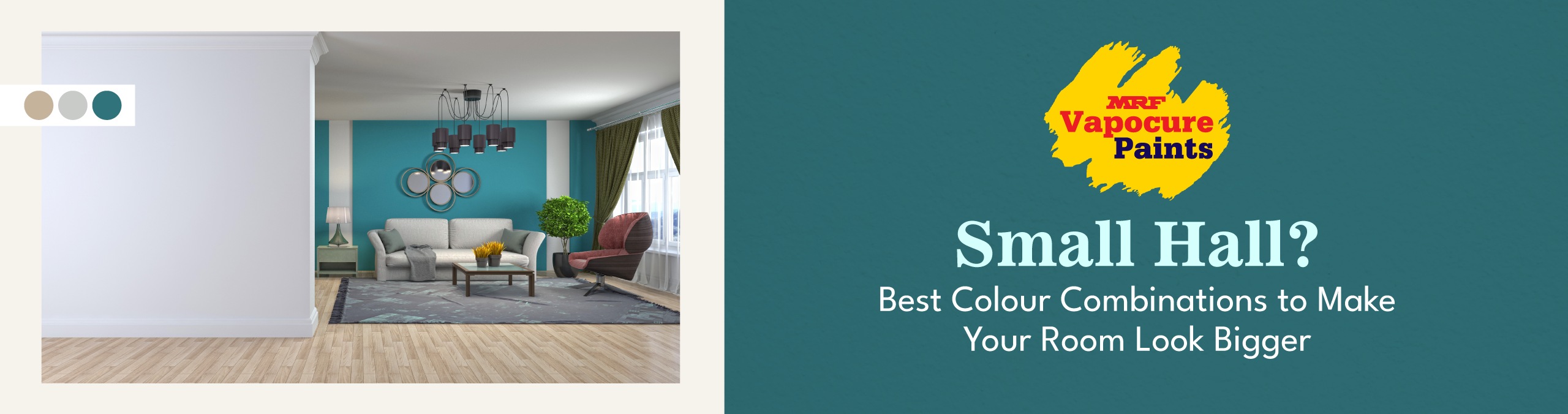
Small Hall? Best Colour Combinations to Make Your Room Look Bigger
Is your hall small, cramped, or narrow? Do you feel your living room looks crowded even after cleaning and arranging furniture properly? Friends, let me tell you one thing, you are not alone. Many Indian homes, especially apartments and compact houses, have small halls, particularly in big cities like Mumbai, Chennai, Bangalore, etc.
But the good news is you don’t need to break walls or spend a lot of money on renovation to make your hall look bigger. If you choose the right wall colour combinations, you can instantly make a small hall feel spacious, bright, and airy.
In this article, we will explain:
- Importance of colour in a small hall
- Which colours make a small hall look bigger
- Best colours that make a small hall look bigger
- Best colour combinations for small halls
- Accent wall: Yes or no for small halls?
- Best ceiling colours for small halls
- Does wall paint finish matter for small halls?
- Floor colour tips for small halls
- Curtain and furniture colour tips
Let’s get started.
Importance of Colour in a Small Hall
Colour is not only meant to beautify walls; it directly affects how big or small a room looks.
1. Colour Affects the Visual Size of Your Room
Light colours reflect more light, which makes walls appear farther apart. It makes the hall look bigger, wider etc. Dark colours absorb light and make walls feel closer, which can make a small hall look cramped and congested.
2. Colour Affects How Bright the Hall Looks
Most small halls do not get enough sunlight. Light colours like white, cream, beige, and pastel shades help spread whatever light is available across the room. This makes your hall look brighter and more lively instead of dull.
3. Colour Affects the Mood of the Room
Soft and light colours make the hall feel calm, fresh, and welcoming. This is important because the hall is the place where family members sit together, have conversations, and welcome guests. The wrong colours can make the space feel uncomfortable, crowded, heavy, and dull.
4. Colour Helps Everything Look Well-Matched
When you choose the right wall colour, it becomes easier to match furniture, curtains, flooring, and décor. This makes your hall look neat, clean, balanced, and well organised instead of messy and mismatched.
Which Colours Make a Small Hall Look Bigger?
Light and Smart Colour Choices:
- Reflect more light
- Make the space look larger and more spacious
- Create an open and breathable feel
Dark or Wrong Colour Choices:
- Absorb more light
- Make walls feel closer and crowded
- Make the room look small and messy
Hence, choosing the right colour combination is the easiest and most affordable way to make a small hall look bigger.
Best Colours That Make a Small Hall Look Bigger
Before discussing combinations, let’s understand which colours work best for small spaces.
1. White: The Safest and Smartest Choice
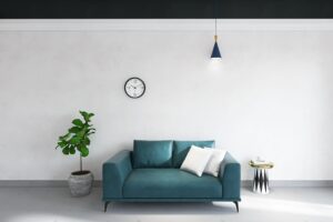
White reflects maximum light and creates an open look.
- Makes the room look bigger
- Works with all furniture types
- Never goes out of fashion
Warm whites, off-white, ivory, and pearl white are some of the best options.
Advice: Avoid pure bright white if you want a cozy feel. Choose slightly warm whites instead.
2. Light Cream & Beige: Warm Yet Spacious
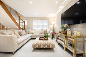
Cream and beige shades are perfect if you want:
- A soft look
- Warmth without shrinking the room
They give a luxury hotel-like feel and pair well with wooden furniture.
3. Light Grey: Modern & Spacious
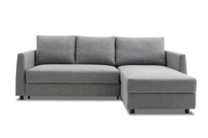
Light grey is a popular choice for modern homes because it:
- Looks elegant
- Makes small halls feel wider
- Matches well with white ceilings
Advice: Always choose light grey, not dark grey, for small halls.
4. Pastel Shades: Soft & Airy
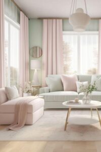
Pastel colours are light and perfect for compact spaces. Best pastel shades include:
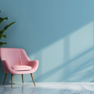
- Pastel blue
- Mint green
- Lavender
- Peach
- Baby pink
Best Colour Combinations for Small Halls
Now let us look at winning colour combinations that visually expand your hall.
1. White + Light Grey
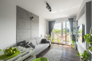
Best for modern apartments because:
- White walls reflect light
- Light grey adds depth without shrinking space
This combination looks clean and stylish and makes ceilings appear higher. You can use white on three walls and light grey on one accent wall.
2. Cream + Soft Brown

Best for traditional or family homes:
- Cream keeps the space open and wide
- Soft brown adds warmth
This combination feels cosy and elegant without making the room dull.
Advice: Avoid dark brown. Always choose light or coffee shades.
3. Pastel Blue + White
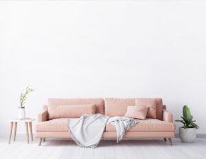
- Best for peaceful and airy halls:
- Blue creates calmness
- White enhances brightness
This combination works especially well in rooms with natural light.
4. Beige + White
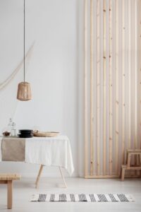
Best for small halls with less sunlight:
- Beige adds warmth
- White prevents dullness
This combination is balanced, timeless, and easy to maintain.
5. Light Green + Cream

Best for nature-inspired interiors and ideal for Indian homes:
- Green feels refreshing
- Cream keeps the space light
6. Monochrome Look (Same Colour, Different Shades)
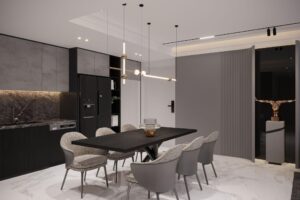
Using one colour in different light shades creates a continuous look that makes the room appear bigger. Examples are:
- Light grey walls
- White ceiling
This look has no visual breaks and is perfect for very small halls
Accent Wall: Yes or No for Small Halls?
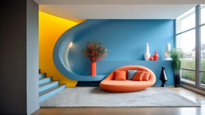
An accent wall is one wall painted or decorated differently from the rest. In small halls, accent walls can work if the colour is light. Recommended accent colours:
- Pastel shades
- Light grey
- Soft peach
- Muted blue
Avoid these colours:
- Dark maroon
- Navy blue
- Dark purple
- Black
Best Ceiling Colours for Small Halls
Ceiling colour plays a major role in how tall a room feels. Always choose light colours because they:
- Make the room look taller
- Maintain an open and airy feel
Best ceiling colours:
- White
- Off-white
- Very light cream
Advice: Avoid dark ceilings in small halls.
Does Wall Paint Finish Matter for Small Halls?
Yes, very much. The best finishes for small halls are satin, eggshell, and soft sheen because:
- They gently reflect light, making the hall look brighter
- They hide minor wall marks and uneven spots
- They make the room look open and airy
- They are easy to clean
Avoid the following finishes:
Matte finish: Absorbs light, making the room look dark, dull, and smaller
High-gloss finish: Highlights wall defects and creates glare, making small rooms visually busy and tiring
Floor Colour Tips for Small Halls
Wall colours alone are not enough. Flooring also plays an important role.
- Light-coloured tiles or marble make the hall look bigger
- Beige, white, or light grey floors are ideal for small halls
- Large tiles create fewer joints, giving a spacious feel
- Avoid very dark floors in compact halls
Curtain and Furniture Colour Tips
Curtains:
- Choose light shades
- White, cream, and pastel colours work best
Furniture:
- Light wood or neutral-coloured furniture is ideal
- Avoid bulky, dark-coloured furniture
Matching everything in light tones enhances the visual space.
Questions On Wall Colour Combination for Hall:
Q1. Which colours should you avoid in small halls?
Dark red, navy blue, dark brown, purple, and black should be avoided as they make small halls look more compact.
Q2. Which colour makes a small hall look bigger?
White, off-white, light grey, and pastel shades make a small hall look bigger.
Q3. Can I use two colours in a small hall?
Yes, but keep both colours light and soft.
Q4. Is grey good for a small living room?
Yes, light grey is excellent for making a small hall look modern and spacious.
Q5. Should walls and ceilings be the same colour?
The ceiling should always be lighter than the walls to make the room look taller.
Q6. Does lighting affect colour choice?
Yes, natural light enhances light colours even more.
Faqs :
1. What is the best colour combination for a hall?
The most reliable hall combinations are a light neutral on three walls with one deeper accent wall — for example off-white or beige walls with a single warm terracotta, teal, or charcoal feature wall. This keeps the room bright and spacious while giving it character. For most Indian halls, a warm neutral base photographs and lives better than stark white, which can feel clinical.
2. What two colours go well together in a hall?
Classic hall pairings are beige + brown, grey + white, cream + sage green, and off-white + teal. The rule that rarely fails: one light, airy colour on most of the walls and one richer colour as an accent. Keep the two colours in the same temperature family (both warm or both cool) so they feel intentional rather than clashing.
3. How do I choose a colour combination for my hall?
Start from three fixed things — the flooring, the largest furniture, and how much natural light the hall gets — then pick wall colours that flatter them. Dark or low-light halls need lighter, warmer walls to open up; bright halls can carry deeper, moodier tones. Always test a sample patch on the actual wall and view it at morning, noon, and night before committing.
4. What is the most popular hall colour in Indian homes?
Warm neutrals — beige, cream, ivory, and soft greys — are the most popular hall colours in Indian homes because they suit our lighting, hide everyday marks, and pair with wooden furniture and traditional décor. Among accent choices, teal, mustard, and terracotta are the most-loved for adding personality without overwhelming the space.
5. Should all the walls in a hall be the same colour?
Not necessarily — painting three walls a light neutral and one wall a deeper accent colour is the most popular and forgiving approach, adding depth without shrinking the room. An all-one-colour hall is calm and safe; a single accent wall is more interesting; using more than two colours on hall walls usually looks busy.
6. How many colours should I use in a hall?
Stick to two colours on the walls — one dominant, one accent — plus the ceiling (usually white or an off-white). More than two wall colours in a single hall tends to look chaotic and makes the room feel smaller. You can add further colour through furnishings and curtains rather than paint.
7. What colour makes a hall look bigger and brighter?
Light, warm off-whites, soft greys, and pale beiges make a hall look the largest and brightest because they reflect the most light. Painting the ceiling a shade lighter than the walls and continuing one wall colour around corners also visually expands the space. Avoid dark colours on all four walls in a small hall.
8. What is a good colour combination for the hall and ceiling?
Keep the ceiling white or a hint lighter than the walls — a beige hall with a soft-white ceiling, or a grey hall with a bright-white ceiling, both feel open and clean. A ceiling darker than the walls lowers the room visually, so reserve that only for very high ceilings you want to bring down.
9. What are the trending hall colour combinations for 2026?
The 2026 trends are warm, earthy palettes — terracotta, clay, muted olive, and sage — paired with creamy neutrals, plus soft “greige” (grey-beige) as an all-over base. Deep teal and charcoal accent walls remain strong. The cool, stark greys of past years are giving way to warmer, cosier tones.
10. What colour combination suits a hall with wooden furniture?
Halls with wooden furniture look best against warm neutrals — cream, beige, warm white, and greige — which let the wood tones stand out. For an accent, deep green or muted blue pairs beautifully with wood. Avoid cool blue-greys, which can make warm wood look orange and out of place.
11. What is the best two-colour combination for a hall?
The best two-colour hall schemes pair a light dominant shade with a deeper accent: off-white + charcoal, beige + teal, cream + terracotta, or light grey + navy. Put the lighter colour on the main walls and the darker one on a single feature wall (usually the TV or sofa wall). This is the most requested and most reliable format.
12. Can I use three colours in a hall?
You can, but do it carefully: use two on the walls and reserve the third for the ceiling or a small architectural feature — not three colours competing across the wall surfaces. A common safe three-colour scheme is white ceiling, neutral main walls, and one bold accent wall. More than that risks looking disjointed.
13. What is a simple two-colour combination for a hall wall?
The simplest, most foolproof two-colour hall wall is off-white on three walls with one wall in a soft, muted accent (dusty blue, sage, or warm grey). It needs no design skill, suits any furniture, and is easy to repaint later. This is the ideal choice if you want low-risk and timeless.
14. Which colour combination is best for the hall as per current Asian-paint-style trends?
Regardless of brand, the on-trend hall formulas right now are greige + white, terracotta accent + cream, sage green + off-white, and charcoal accent + light grey. These “designer” combinations work because they balance a calm neutral majority with one characterful accent — you can achieve every one of them in MRF’s interior emulsion shades.
15. What is a good hall colour combination on a low budget?
On a budget, paint all walls one warm neutral (off-white or light beige) in a quality washable emulsion, and skip the accent wall — a single well-chosen neutral looks clean and intentional without extra cost. If you want one accent, a single feature wall uses very little paint for a big visual change. A durable washable finish saves money long-term by needing fewer repaints.
16. Which colour combination is best with white walls in a hall?
White hall walls pair best with a single warm or bold accent — teal, mustard, navy, or terracotta — to stop the room feeling stark. Add warmth through wood furniture and coloured furnishings. Pure brilliant white can feel cold in a hall, so a soft or warm white base is usually more inviting.
17. Is grey a good colour for a hall?
Grey is an excellent, versatile hall colour — but choose a warm grey (“greige”) over a cool blue-grey, which can feel cold in Indian light. Pair light grey walls with a white ceiling and a charcoal or navy accent wall, or with warm wood and mustard furnishings. Grey hides marks well and suits modern interiors.
18. What colour goes with beige walls in a hall?
Beige walls pair beautifully with brown, cream, deep green, and terracotta accents, plus wooden furniture — it’s one of the most flexible, welcoming hall bases. For contrast, a single charcoal or teal accent wall lifts an all-beige hall. Beige is popular precisely because almost everything coordinates with it.
19. Is a blue colour combination good for a hall?
Blue works well in a hall when used as an accent or in muted tones — dusty blue, teal, or navy on one wall against light neutral walls looks calm and sophisticated. Avoid painting a whole small hall in a strong blue, which can feel cold and closed-in. Pair blue with warm neutrals and wood to balance it.
20. What is a good cream or off-white hall combination?
Cream and off-white halls pair effortlessly with brown, sage, muted blue, and gold accents, and are the safest choice for resale and for rooms with mixed furniture. They feel warmer and cosier than bright white. Add one accent wall or coloured furnishings so the space doesn’t read as flat.
21. Does green work as a hall colour?
Yes — muted greens like sage, olive, and eucalyptus are among the most popular 2026 hall colours because they feel natural and calming and pair with both wood and neutral tones. Use green as the dominant neutral (sage on all walls) or as a single accent wall. Avoid very bright or lime greens, which tire the eye in a living space.
22. Is a brown colour combination suitable for a hall?
Brown suits a hall when balanced with lighter neutrals — chocolate or coffee as one accent wall against beige or cream walls creates a warm, grounded, premium feel. Avoid brown on all four walls in a small or dim hall, as it absorbs light and shrinks the space. Brown pairs naturally with wooden interiors.
23. What accent-wall colour looks best in a hall?
The most effective hall accent-wall colours are teal, charcoal, terracotta, navy, and deep green — rich enough to create a focal point against light neutral walls. Put the accent on the wall the eye lands on first (usually behind the TV or main sofa). One accent wall is the highest-impact, lowest-risk way to add colour.
24. Which colour combination is best for a north- or low-light hall?
Low-light and north-facing halls need warm, light colours — warm white, cream, soft peach, and light greige — to compensate for the lack of natural warmth. Avoid cool greys and blues, which look dull and grey in poor light. Reserve any dark accent for a wall that does catch some light.
25. What colour suits a hall that gets strong afternoon sun?
Bright, sun-filled halls can carry cooler and deeper tones — soft grey, sage, muted blue, or even a charcoal accent — without feeling dark, because there’s plenty of natural light to balance them. Strong warm colours can feel overpowering in a very sunny hall, so lean slightly cooler here.
26. What is the best colour combination for a small hall?
For a small hall, use light, warm neutrals on all walls — off-white, light beige, or pale greige — to maximise the sense of space, with at most one soft accent wall. Keep the ceiling white and use a single wall colour flowing around corners to avoid a boxed-in feel. Dark colours on multiple walls will make a small hall feel smaller.
27. What colour combination works for a large hall?
A large hall can handle richer and layered schemes — a deep accent wall, two-tone treatments, or warmer saturated neutrals — without feeling closed in. Use colour to define zones (e.g. a warmer tone around the seating area) in an open-plan hall. Large halls are where you can be bolder than a compact room allows.
28. Since “hall” means the living room in India, what colours suit it best?
For an Indian hall (living/drawing room), warm neutrals — beige, cream, greige, ivory — are the best all-round base because they suit our light, hide daily wear, and complement wooden furniture and festive décor. Add personality with one accent wall in teal, terracotta, or deep green. It’s the room guests see first, so most people choose welcoming warm tones over cool ones.
29. What is a good colour combination for a hall and dining area together?
For a combined hall and dining space, keep one continuous neutral across both zones for flow, then differentiate with a single accent — for example a feature wall behind the dining table. Using the same base colour throughout makes an open-plan hall-dining feel larger and more cohesive than switching colours between the zones.
30. What colour combination suits a hall with a high ceiling?
Halls with high ceilings can take a slightly darker ceiling colour or a bold accent wall to bring the proportions down and add cosiness. Vertical two-tone treatments (deeper lower, lighter upper) also work well. This is one of the few cases where a ceiling darker than the walls is a good idea.
31. What wall colour goes with a TV/entertainment unit in the hall?
The TV wall is the ideal accent wall — a deep charcoal, navy, or muted teal behind the unit reduces screen glare and makes the setup look premium, while the other walls stay light. Avoid a very glossy finish here, as it reflects the screen; a matte or low-sheen accent works best.
32. What is the best colour for a hall with marble or granite flooring?
Cool, glossy flooring like white marble pairs best with warm neutral walls (cream, beige, greige) to balance its coolness, while darker granite works with lighter walls that lift the room. Match the wall undertone to the flooring’s undertone — warm floor, warm walls — for a coordinated look.
33. What are some hall wall design and colour ideas beyond flat paint?
Popular hall wall treatments include a single textured accent wall, a two-tone horizontal split, geometric or panel designs behind the sofa/TV, and a subtle metallic or stucco feature. Keep textures and designs to one wall so the room stays calm. These add depth that flat colour alone can’t, especially on the main focal wall.
34. What is a good textured wall colour combination for a hall?
Texture reads best in a tone close to the surrounding walls — a beige textured accent against cream walls, or a charcoal textured wall against light grey — so the texture, not a colour clash, is the feature. Confine texture to one wall; textured paint on all walls in a hall is overwhelming and dates quickly.
35. Should I use a matte or glossy finish on hall walls?
Use a matte or low-sheen (eggshell/satin) emulsion on hall walls — matte hides wall imperfections and looks contemporary, while a low sheen adds subtle depth and is easier to wipe clean. Avoid high-gloss on large wall areas; it highlights every unevenness. A washable matte or satin emulsion is the practical sweet spot for a living space.
36. What is a two-tone wall design for a hall?
A two-tone hall wall splits a single wall horizontally — a deeper colour on the lower third or two-thirds and a lighter shade above — often divided by a slim trim or moulding. It adds architectural interest and is a popular way to introduce a second colour without a full accent wall. Keep both tones in the same family for a refined result.
37. Can I combine wallpaper with paint in a hall?
Yes — a common, effective approach is wallpaper on one feature wall with the remaining walls painted in a colour drawn from the wallpaper’s palette. This ties the room together and is cheaper than papering the whole hall. Pick the paint colour after choosing the wallpaper, matching it to one of the paper’s minor tones.
38. What type of paint is best for hall walls?
An interior emulsion (water-based) is best for hall walls — it’s low-odour, dries fast, comes in matte to satin finishes, and is washable in its better grades. For a living room that sees daily use, choose a premium washable emulsion such as MRF’s interior emulsion range so marks wipe off without leaving patches. Avoid exterior or enamel paints indoors.
39. Which is better for a hall — distemper or emulsion?
Emulsion is better for a hall in almost every way — it’s washable, more durable, available in richer colours and finishes, and looks far more premium than distemper. Distemper is cheaper but chalks, marks easily, and can’t be cleaned, so it’s a false economy in a room you use every day. Reserve distemper for low-priority or rental spaces only.
40. How do I pick a washable paint for a hall with kids?
For a hall with children, choose a premium washable/scrubbable emulsion in a matte or satin finish, ideally a low-VOC formulation for indoor air quality. Washable emulsions let you wipe off crayon, food, and handprints without the colour rubbing off. Darker or mid-tone accent walls also hide marks better than pale walls in high-traffic family halls.
41. How much paint do I need for a hall?
As a rough guide, one litre of emulsion covers about 130–140 sq. ft. per coat, and walls need two coats — so a typical hall needs several litres depending on wall area and whether you’re doing an accent wall separately. Measure wall length × height, subtract large openings, and always buy a little extra from the same batch to avoid colour mismatch on touch-ups.
42. Do lighter or darker hall colours cost more to maintain?
Lighter walls show marks and need cleaning or touch-ups more often, while mid-tones and warm neutrals hide daily wear better and stay looking fresh longer. A washable emulsion reduces maintenance for any colour. Over the life of the paint, a durable finish matters more to cost than the shade you pick.
43. How often should a hall be repainted?
A hall painted with a good-quality emulsion typically looks fresh for 4–6 years before needing a repaint, longer with a washable premium finish. High-traffic family halls or those with direct sun may need attention sooner. Spot-cleaning and occasional touch-ups extend the interval significantly.
44. What hall colours create a calm, relaxing feel?
Soft, muted tones create the calmest halls — sage green, dusty blue, warm greige, and off-white lower visual stimulation and feel restful. Keep contrast gentle and finishes matte for a soothing effect. Reserve bold, saturated colours for small accents rather than whole walls if calm is the goal.
45. What hall colours feel warm and welcoming?
Warm neutrals and earthy tones — cream, beige, terracotta, mustard, and warm greige — make a hall feel the most welcoming, which is why they dominate Indian living rooms. Pair them with warm-white lighting to enhance the effect. Cool blue-greys, by contrast, can feel formal or distant in a living space.
46. Are there Vastu-recommended colours for a hall?
In Vastu, halls are often advised to use light, positive tones — whites, creams, light yellows, and soft greens — with the specific recommendation sometimes tied to the room’s direction (e.g. greens/blues for north/east, warm tones for south). Treat this as one input alongside light and décor rather than a strict rule; a warm neutral base satisfies most Vastu guidance anyway.
47. What hall colour combination is best for resale value?
Neutral, broadly appealing schemes — off-white, beige, greige, or light grey with at most one restrained accent — are best for resale, because buyers can picture their own furniture against them. Bold or highly personal colour schemes can put off buyers even when well executed. Neutral now, personality through furnishings, is the resale-safe strategy.