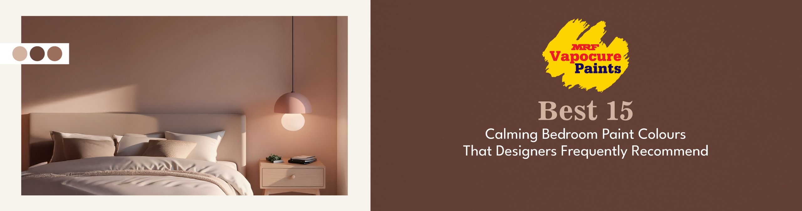
Best 15 Calming Bedroom Paint Colours That Designers Frequently Recommend
If your bedroom feels “busy” even when it is tidy, the wall colour might be the reason. Calm shades work because they soften contrast and make the room feel settled in both daylight and warm night lighting. In this blog, we have covered 15 designer-favourite bedroom paint colour ideas, so read till the end to find the one that suits your space best.
From Decorative to Intentional: How Colour Became Part of Restful Design
Bedrooms are no longer just sleeping spaces. In recent years, designers and researchers have increasingly emphasised the emotional and functional role of colour in interiors, especially in spaces dedicated to rest, focus, and well-being.
Recent interior design trend reports clearly highlight a shift toward wellness-focused spaces, where colour serves an intentional purpose rather than just decoration. In a latest trend report, biophilic design, the practice of visually and materially connecting interiors with nature, was identified as a leading theme, influencing colour palettes, materials and spatial planning because it promotes a grounded, calming ambience.
Design professionals have also noted that interiors are increasingly functioning as restorative environments today; places consciously designed to reduce sensory stress and enhance comfort. Research into restorative interiors, including studies on residential spaces that combine minimal and natural styles, supports the idea that thoughtfully designed environments can improve well-being and reduce fatigue, especially in compact homes where people work and live in the same room.
The global design community is responding to these shifts by recommending muted, nature-linked and warm colour palettes over high-contrast, highly saturated choices. Not only do these hues perform better under changing light (daylight vs evening lamps), they also align with larger interior trends that prioritise calm, cohesion, and emotional comfort in bedrooms.
In this blog, we explore the 15 most calming bedroom paint colours that designers frequently recommend, each paired with an MRF shade that reflects the direction of current design thinking.
Best 15 Calming Bedroom Paint Colours That Designers Frequently Recommend
1. Neutral Colours for a Calming Effect
Warm Ivory
MRF Shade: POLITE
Warm ivory has largely replaced stark white in bedroom design. Designers avoid pure white because it amplifies glare, especially in LED lighting. Warm ivory softens architectural edges and makes textiles appear richer.
It is particularly effective in compact bedrooms where you want openness without sterility. It reflects light gently, not sharply, which keeps the room visually calm.
Why designers recommend it:
• Reduces contrast strain
• Enhances natural materials
• Adapts well across décor changes
2. Blue Tones for Relaxation and Serenity
Misty Powder Blue
MRF Shade: CLOUD-LESS BLUE
Soft, muted blues remain one of the most consistently specified bedroom colours globally. The reason is not just psychology. Powder blues absorb enough light to feel atmospheric without shrinking the space.
Designers favour dusty blues over bright ones because high saturation creates visual activity. Misty powder blue remains restrained.
Why designers recommend it:
• Feels expansive without being cold
• Works across coastal, modern and classic interiors
• Performs consistently in warm night lighting
3. Green Shades for a Natural and Soothing Vibe
Soft Sage Green
MRF Shade: SEA CLIFF SAGE
Sage has become one of the most specified colours in contemporary residential design. It behaves like a neutral while still offering personality.
It balances warm wood floors and cool fabrics effortlessly. Unlike stronger greens, sage contains grey undertones that prevent it from feeling vibrant.
Why designers recommend it:
• Supports biophilic design trends
• Feels grounded but not dark
• Bridges warm and cool palettes
4. Earthy Browns and Beiges for a Grounded Atmosphere
Oat Beige
MRF Shade: OATMEAL
The return of earthy tones reflects a broader move toward mineral and clay-inspired interiors. Oat beige works because it reduces visual stimulation while maintaining warmth.
It also performs exceptionally well in Indian homes where warm lighting is common. The beige undertone prevents the room from feeling flat.
Why designers recommend it:
• Creates a cocooning effect without darkness
• Makes layered bedding look intentional
• Ages gracefully over time
5. Pastel Hues for a Soft and Tranquil Space
Pale Lavender
MRF Shade: NOT QUITE LAVENDER
Pastels have matured. Designers now use muted pastels to introduce softness without theme-based décor. Pale lavender offers gentle depth while staying understated.
It pairs beautifully with greige and off-whites, creating a refined tonal palette rather than a decorative look.
Why designers recommend it:
• Adds personality without boldness
• Softens sharp architectural lines
• Feels luxurious in subtle ways
6. Dark Colours for Cosiness and Intimacy
Deep Charcoal
MRF Shade: RAVEN
Contrary to popular belief, darker shades can be deeply calming. Designers use deep charcoal to create a visual enclosure. It reduces brightness and enhances the glow of warm bedside lighting.
In larger bedrooms, charcoal creates a hotel-style sophistication.
Why designers recommend it:
• Minimises glare
• Creates intimacy
• Elevates light-coloured bedding
7. Muted Purples for a Calm and Luxe Mood
Smoky Mauve
MRF Shade: DIGNIFIED MAUVE
Muted purples are being used as an alternative to beige-heavy interiors. Smoky mauve contains enough grey to stay refined. It introduces quiet luxury without dramatic contrast.
Why designers recommend it:
• Feels upscale yet calm
• Pairs well with warm metals
• Adds depth without heaviness
8. Soft Pinks for a Gentle and Romantic Feel
Dusty Blush Pink
MRF Shade: BLUSHING
Modern blush shades are dusty and muted. Designers avoid bright pinks and instead choose softened versions that read almost neutral. Dusty blush works particularly well in bedrooms that need warmth.
Why designers recommend it:
• Enhances warm lighting
• Feels comforting
• Supports both traditional and modern décor
9. Greige Tones for Modern Minimal Serenity
Balanced Greige
MRF Shade: GREIGE SCALLOP
Greige remains one of the most specified interior colours globally because it adapts to both warm and cool environments. It eliminates the tension between grey and beige furniture pieces.
Why designers recommend it:
• Unifies mixed materials
• Creates tonal depth
• Remains trend-resistant
10. Warm Terracotta Shades for a Cosy, Sun-Kissed Look
Soft Terracotta Clay
MRF Shade: HAT TRICK TERRA
Terracotta reflects the rise of earthy interiors. When muted, it introduces warmth without overwhelming the senses. Designers often use it behind headboards to anchor the room.
Why designers recommend it:
• Feels grounded and natural
• Complements neutral textiles
• Adds warmth without saturation
11. Creamy Yellows for a Soft Morning Glow
Buttercream Yellow
MRF Shade: SMOOTH AS BUTTER
Creamy yellow works best in cooler rooms. It reflects light in a way that mimics early morning sunlight. The key is choosing a subdued tone, not a bright lemon.
Why designers recommend it:
• Warms shaded bedrooms
• Prevents dullness
• Feels cheerful yet controlled
12. Stone and Taupe Tones for a Spa-Like Bedroom Mood
Stone Taupe
MRF Shade: FIELDSTONE
Taupe shades mirror natural stone, which is why they feel calming. Designers use them to create spa-inspired bedrooms. These tones reduce contrast and allow texture to take centre stage.
Why designers recommend it:
• Feels organic
• Supports layered fabrics
• Works across lighting conditions
13. Dusty Rose and Mauve for Subtle Warmth
Dusty Rose
MRF Shade: RHUBARB ROSE
Dusty rose is deeper and more grounded than blush. It creates warmth while maintaining restraint. It works particularly well with greige and ivory combinations.
Why designers recommend it:
• Adds depth without drama
• Feels inviting
• Modern alternative to beige
14. Deep Blues for a Cocooned, Sleep-Friendly Space
Deep Ink Blue
MRF Shade: DEEP BLUE SEA
Deep blues are often chosen for master bedrooms. They absorb light and create depth, which helps reduce visual stimulation. Used with warm lighting, they feel secure and enveloping.
Why designers recommend it:
• Encourages a restful atmosphere
• Adds sophistication
• Ideal for feature or full-room application
15. Monochrome Neutrals for a Clean and Quiet Look
Soft Ash Grey
MRF Shade: CATHEDRAL GRAY
Soft ash grey works when kept tonal. Designers avoid pairing it with stark white and instead layer similar muted shades. The result is a clean, composed environment.
Why designers recommend it:
• Feels structured yet calm
• Works in contemporary apartments
• Easy to accessorise
Made to Look Good, Made to Last
At MRF Vapocure Paints, we believe a good paint finish should do two things well: look beautiful on day one and stay dependable through everyday living. From calm neutrals to deeper mood shades, our interior paints are designed for strong coverage, lasting colour, and finishes that match your theme and expectations. With a wide range of shades to choose from, you can align your bedroom colour with its lighting, furniture, and comfort level, creating a space that feels easy to come back to every day.
Final Insight
A calming bedroom is not achieved by choosing a single soft shade. It comes from reducing contrast, choosing muted pigments, layering texture, and paying attention to how the colour behaves in your lighting. Pick a shade that looks good in the morning and still feels soft at night, and you will create a space you genuinely enjoy coming back to, calm and comforting the moment you step in.
FAQs
1) What is the easiest calming colour for any bedroom?
Warm ivory, balanced greige, or soft ash grey. These shades suit most rooms and do not clash with furniture or curtains.
2) Do calming colours need to be light?
Not always. Deep charcoal and deep ink blue can feel very calming, too, as long as you use warm lighting and keep bedding lighter.
3) Why does a colour look different at night?
Because bedroom lighting is usually warm. Warm bulbs change undertones, so a shade that looks perfect in daylight can look different after sunset.
4) What if my bedroom gets very little sunlight?
Go warmer. Shades like warm ivory, oat beige, buttercream yellow, or stone taupe will make the room feel more welcoming.
5) Can I use two colours in the same bedroom?
Yes. Keep it simple: one main wall shade and one deeper shade for a feature wall, or use the second shade only in soft furnishings.