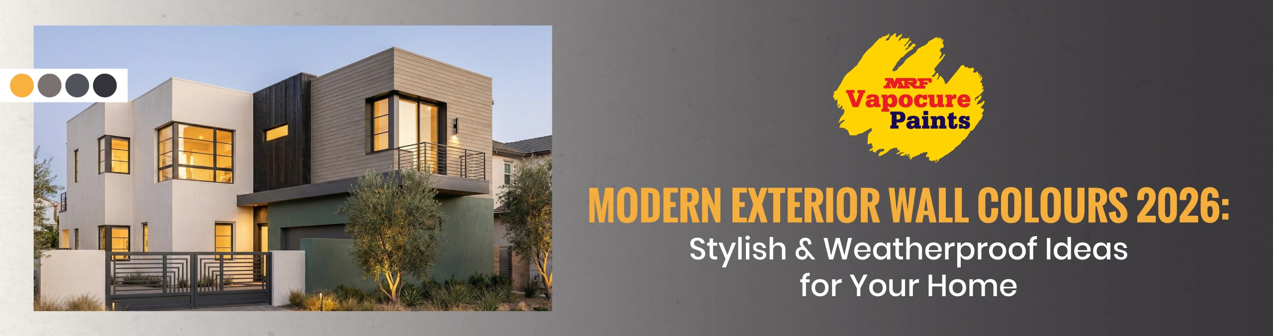
Modern Exterior Wall Colours |Stylish & Weatherproof Ideas for Your Home
Most people decide to repaint the exterior only when the walls really start to show it: faded patches, dust streaks under window sills, damp marks near pipes, odd touch-ups from old repairs. When you finally say, “Let’s repaint this year”, you don’t just want a new colour. You want the house to look modern, neat and ready to handle the weather for the next few years.
Let’s Begin
Every few years, the same scene plays out.
The walls are peeling, the colours have faded, there are dark streaks under the windows… and someone at home finally says, “This time, let’s paint it properly and make it look modern.”
You open your phone, search for modern grey exterior paint, modern house colour combination, trendy modern exterior paint colours, and get flooded with photos that don’t look anything like your street or your building.
The truth is simple:
A modern exterior in 2026 is not about copying a picture.
It is about three things working together:
- A calm base colour that looks good in strong sun and soft evening light
- A clear supporting shade that gives the building shape
- A weatherproof exterior system that can handle heat, rain, dust and damp
This blog uses that lens and gives you modern exterior paint colour ideas that feel current, are practical to maintain and can be matched easily from the MRF Vapocure Paints shade card.
Before Colours: 3 Quick Checks Outside Your Gate
Stand outside, look at your facade and note three things:
- How close is your building to the road?
- Main road with splashes and dust?
- Quiet inner lane?
- Building setback with a small garden?
- How does light fall on the front?
- Long, harsh afternoon sun?
- Mostly shade from other buildings or trees?
- What are you not changing?
- Tiles on steps and compound wall
- Balcony grills, railings, and window frames
- Gate colour and material
Keep these in mind as you read the combinations below. The goal is not to copy a picture, but to find a modern scheme that suits your exact setting.
Modern Exterior Wall Colours 2026: Stylish & Weatherproof Ideas for Your Home
1. Calm Grey & Clean Off-White
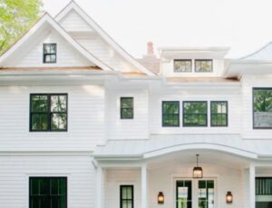
Shade suggestions
- Main walls: GREY SKIES
- Trims and bands: ORIGINAL OFF WHITE
- Grills and gate: RAVEN
This combination gives you a modern look without making the house feel dull. Grey Skies keeps the frontage calm and hides everyday dust better than pure light shades, while Original Off White lifts edges and slabs so the elevation looks neat and intentional. Raven frames grills cleanly, which sharpens the overall structure.
2. Greige with Quiet Metal Highlights
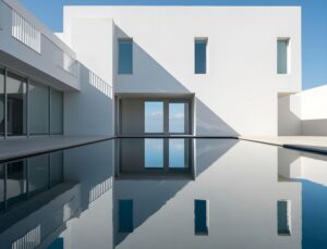
Shade suggestions
- Main walls: GREIGE SCALLOP
- Highlight strips and details: BRONZED GOLD
- Door and wood panels: BRAZILIAN ROSEWOOD
If your facade is wider, you need a body colour with presence but not heaviness. Greige Scallop stays balanced across morning, afternoon and evening light, while Bronzed Gold adds a controlled highlight that looks premium when sunlight or outdoor lighting hits it. Brazilian Rosewood warms up the entrance, so the scheme does not feel flat.
3. Sand, Stone & Deep Trim
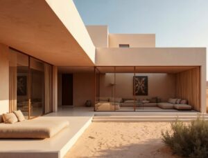
Shade suggestions
- Main walls: SPIAGGIA SAND
- Feature blocks and planes: MINERVA GREY
- Deep trims and select grills: OBSCURE LICORICE
This palette keeps things modern while still feeling warm and familiar. Spiaggia Sand reduces glare and stays pleasant in strong sun, while Minerva Grey adds shape to key blocks so the frontage looks structured, not washed out. Obscure Licorice gives railings and trims a crisp finish and helps high-touch areas stay presentable for longer.
4. Pebble Grey & Sage
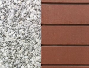
Shade suggestions
- Main walls: ROOMY GREY
- Accent planes and balcony fronts: SEA CLIFF SAGE
- Trims and edges: IVORY LACE
This works beautifully when greenery is part of your frontage. Roomy Grey reads like a quiet, stone-like base that feels natural outdoors, while Sea Cliff Sage ties the facade visually to plants without turning the home into a strong colour statement. Ivory Lace keeps edges clean, so the elevation looks finished in both photos and real life.
5. Stone White, Charcoal & Cocoa
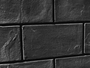
Shade suggestions
- Main walls: WHITE MARBLE
- Strong structural planes: DARK KNIGHT
- Door and select panels: BISCOTTI BROWN
If you want a sharp outline without loud colour, this is a strong choice. White Marble keeps the building bright without looking harsh, while Dark Knight defines the elevation and makes architectural lines stand out, especially under evening lights. Biscotti Brown softens the entrance so the overall look stays elegant, not severe.
6. Cool Grey, Beige & Wood
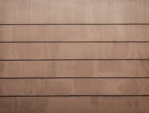
Shade suggestions
- Cool grey planes: CHANCE OF RAIN
- Complementary beige walls: BAUHAUS BEIGE
- Wood-tone accents: SUMPTUOUS SUEDE
This palette is ideal for homes that sit between traditional and modern. Chance of Rain gives newer, cleaner surfaces a current look, while Bauhaus Beige keeps the rest of the facade feeling warm and cohesive. Sumptuous Suede brings in the right amount of richness on doors and accents, helping the whole frontage feel connected.
7. White, Slate & a Single Bold Door
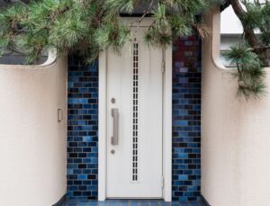
Shade suggestions
- Main walls: UFFIZI GALLERY WHITE
- Slate bands and feature elements: CANNON GREY
- Door and small accent: BOLD BLUE
This scheme stays modern because it is disciplined and easy on the eye. Uffizi Gallery White keeps the facade looking fresh, while Cannon Grey adds structure without making the home feel heavy. Bold Blue gives the entrance a clear identity, and if you ever want a change later, you only repaint the door, not the whole building.
Keeping Modern Colours Looking Modern: Small Habits That Help
Whatever palette you choose, a few practical habits can help the exterior stay sharp for longer.
- Keep it to 2–3 wall colours: One main body shade, one supporting shade and at most one small accent is usually enough. More than that, even a well-planned scheme can start to feel busy.
- Test on the sunniest wall first: Look at the shade in the morning, afternoon and evening. Colours that seem subtle on a shade card can shift noticeably once applied across a full wall.
- Plan for water run-off and damp zones: If certain corners stay damp or downpipes overflow during heavy rain, avoid very light shades there. Slightly deeper tones help those areas look cleaner between maintenance cycles.
- Match grills and gates to the overall scheme: Deeper shades such as Raven or Obscure Licorice on metalwork can instantly make the facade look more structured and finished, even when the wall palette is simple.
Colours and Protection for Every Wall in Your Home
With MRF Vapocure Paints, you have options for every part of the home: interior wall paints to brighten living spaces, exterior wall paints to keep the outside looking fresh, and dedicated damp protection solutions for problem-prone areas. The ranges are designed to work together, so you can choose shades you like and still feel confident about coverage and finish. The focus stays simple: colours that look good when the job is done, and paint films that remain dependable through everyday use, weather changes and routine cleaning.
Summing Up
Modern exterior wall colours in 2026 are less about standing out and more about looking settled, neat and confident. A strong colour scheme should feel right in morning light, hold steady through afternoon sun, and still look composed when outdoor lights come on. Calm base shades paired with one or two deeper supporting tones tend to deliver the most modern result, especially when the palette is kept disciplined.
Rather than chasing trends, it helps to observe your street, your light, and the fixed elements you are not changing. When you choose colours with those factors in mind, the exterior looks intentional and stays easier to maintain. Use the combinations in this blog as starting points, then adjust them to suit your home’s structure and setting.
Questions on Exterior Wall ?
1. What makes an exterior wall colour look modern in 2026?
Modern exteriors use clean, controlled combinations instead of multiple contrasting shades. Soft greys, greige, stone whites and muted neutrals, paired with one deeper supporting tone, create a composed, updated look.
2. Are grey exterior walls still a good choice?
Yes. Softer greys and blue-greys are preferred over very dark or flat tones because they handle sunlight and dust better and feel less harsh across large elevations.
3. How many colours should I use on my exterior walls?
Ideally, two wall colours (main and support) plus one deeper shade for grills, gates, or small highlights. Too many colours can make even a freshly painted facade look cluttered.
4. Should exterior wall colours match the compound wall and gate?
They do not need to match exactly, but they should sit in the same colour family. When walls, gates and grills feel visually connected, the frontage looks more organised.
5. How do I know if a shade will still look good after a few years?
Avoid extremes. Very bright or very dark shades can feel tiring over time. Mid-tones, warm neutrals and softened greys usually age better and remain easier to maintain.
Faqs :
1. What are the best modern exterior colour combinations for homes?
The best modern exterior colour combinations combine neutral shades with complementary accents to create a timeless and elegant appearance. Popular combinations include white and charcoal grey, beige and brown, cream and coffee, sage green and ivory, and light grey with black accents. The right combination should complement your home’s architecture, surroundings, and natural lighting while offering long-lasting visual appeal.
2. Which exterior colour combination is trending in 2026?
Neutral palettes with bold accent colours are the most popular exterior colour combinations in 2026. Homeowners are choosing combinations like ivory with charcoal, warm grey with white, olive green with beige, terracotta with cream, and greige with natural wood finishes. These colour schemes create a clean, contemporary look while remaining timeless.
3. How do I choose the best exterior colour combination for my house?
Choose an exterior colour combination that complements your home’s architecture, climate, and surroundings. Consider your roof colour, window frames, landscaping, neighbouring homes, and the amount of sunlight your exterior receives. Testing colour samples on different walls before painting helps ensure the final result looks balanced throughout the day.
4. Which two-colour combination is best for house exteriors?
White and grey remain the most versatile two-colour combination for modern house exteriors. Other popular choices include cream with brown, beige with charcoal, blue with white, and ivory with dark grey. Using one dominant colour with a contrasting secondary shade adds depth and enhances architectural features.
5. Which three-colour combination works best for modern homes?
A three-colour exterior palette creates visual depth while highlighting architectural details. A popular approach is using one primary wall colour, a secondary shade for feature walls, and a darker accent for trims, gates, or columns. This balanced combination creates a sophisticated and premium appearance.
6. Which exterior colours make a house look luxurious?
Neutral colours with deep contrasting accents give homes a luxurious appearance. Shades like ivory, pearl white, charcoal grey, sandstone, taupe, and rich brown paired with wood or stone textures create a premium exterior that never goes out of style.
7. Which exterior colour combinations are best for Indian homes?
Exterior colour combinations for Indian homes should withstand intense sunlight, rain, humidity, and dust. Cream with brown, ivory with grey, peach with white, beige with coffee, and pastel yellow with terracotta are practical combinations that maintain their beauty in diverse Indian climates.
8. What is the best exterior colour combination for a small house?
Light colour combinations help small houses appear larger and brighter. White with light grey, cream with beige, ivory with soft brown, and pastel shades reflect more natural light, making compact homes feel spacious while maintaining a modern appearance.
9. Which colour combination is best for duplex houses?
Duplex homes look best with contrasting colours that highlight their architectural design. Grey with white, cream with charcoal, beige with dark brown, and ivory with black trims create a contemporary look while emphasizing different levels and elevations.
10. Which exterior colours are ideal for villas?
Luxury villas benefit from elegant neutral colour palettes with natural textures. White, sandstone, taupe, charcoal grey, warm beige, and earthy browns paired with stone or wood finishes create a refined, high-end appearance that complements spacious architecture.
11. Which colour combination suits contemporary home designs?
Contemporary homes look best with clean, minimal colour combinations. White, light grey, charcoal, greige, black, and natural wood accents create a sophisticated exterior that highlights modern architectural lines.
12. Which colour combination is suitable for traditional Indian homes?
Traditional Indian homes look elegant with warm earthy colour combinations. Cream with maroon, beige with terracotta, ivory with brown, mustard with white, and peach with sandstone preserve cultural aesthetics while maintaining a fresh appearance.
13. Which exterior colours stay attractive for years?
Neutral exterior colours remain stylish and visually appealing for many years. White, cream, beige, ivory, warm grey, and sandstone rarely go out of fashion and continue to complement changing landscaping and architectural trends.
14. Which exterior colours fade the least?
Light and medium-toned neutral colours generally retain their appearance longer than darker shades. Premium exterior paints with UV-resistant technology further improve colour retention, especially in regions with strong sunlight.
15. Which colour combination works best with stone cladding?
Neutral wall colours beautifully complement natural stone cladding. White, beige, greige, ivory, and warm grey create a balanced appearance while allowing the stone texture to become the focal point of the façade.
16. Which exterior colour combination works well with wooden panels?
Natural wood pairs exceptionally well with modern neutral colour palettes. White, charcoal grey, greige, cream, and muted green create warmth and sophistication while enhancing the natural beauty of wooden accents.
17. Which exterior colours make a house look bigger?
Light exterior colours visually expand a home’s appearance. White, cream, ivory, light grey, and pastel shades reflect more sunlight, creating the illusion of larger walls and a more spacious exterior.
18. Which colour combination is best for modern house elevations?
Modern elevations stand out with neutral colours combined with bold architectural accents. White with charcoal, beige with black, grey with wood finishes, and cream with natural stone create clean and elegant façades.
19. What is the best exterior colour for homes in hot climates?
Light-coloured exteriors help reduce heat absorption and keep homes cooler. White, ivory, cream, light beige, and soft grey reflect more sunlight, making them ideal choices for regions with high temperatures.
20. Which exterior colour combinations are suitable for coastal homes?
Coastal homes benefit from colours that complement natural surroundings while resisting harsh weather. White, sea green, light blue, sandy beige, ivory, and warm grey create a fresh coastal appearance while maintaining timeless appeal.
21. Should the roof colour match the exterior wall colour?
The roof should complement the exterior wall colour rather than match it exactly. Dark roofs pair beautifully with lighter walls, while lighter roofs offer flexibility to use slightly darker or richer wall colours for contrast.
22. Should the main gate match the house exterior colour?
The main gate should coordinate with the home’s exterior rather than replicate the wall colour. Matching accent colours, trims, or architectural features creates a cohesive and visually pleasing entrance.
23. How many colours should be used on a home’s exterior?
Most homes look balanced when two or three complementary colours are used. One colour should dominate the walls, another should highlight architectural elements, and a third can be reserved for accents like gates, railings, or trims.
24. Can texture paint be combined with exterior colour combinations?
Yes, texture paint adds depth and character when paired with complementary exterior colours. Combining textured feature walls with smooth painted surfaces creates visual interest while enhancing the home’s overall design.
25. How can I test an exterior colour combination before painting my house
Always test paint samples on different exterior walls before making your final decision. Observe the colours in morning, afternoon, and evening light, as natural lighting can significantly change how a colour appears. Testing ensures the selected combination complements your home’s architecture and surroundings.
26. Which exterior colour combination creates a timeless look?
Neutral colour combinations create a timeless exterior that remains stylish for years. Pairing white with grey, cream with brown, or beige with charcoal offers a sophisticated appearance that complements both traditional and modern architectural styles.
27. Which exterior colours increase a home’s curb appeal?
Well-balanced neutral colour combinations significantly enhance a home’s curb appeal. Colours like ivory, warm grey, sandstone, and soft beige create a welcoming first impression while highlighting architectural details and landscaping.
28. Which colour combination is best for a two-storey house?
Two-storey homes look elegant when different architectural levels are subtly defined with complementary colours. Using a lighter primary shade with darker feature walls or trims creates depth without overwhelming the overall design.
29. Which colour combination is ideal for independent houses?
Independent homes offer the flexibility to use both classic and contemporary exterior colour combinations. White with charcoal, cream with coffee brown, or light grey with wood accents creates a balanced and attractive façade.
30. Are neutral exterior colours better than bold colours?
Neutral colours remain the safest choice because they offer timeless appeal and greater versatility. Bold colours can be used as accents on feature walls, trims, or architectural elements without overpowering the home’s exterior.
31. Which grey shade is best for modern house exteriors?
Warm grey shades create a sophisticated and contemporary exterior. Light grey pairs beautifully with white, while darker greys work well with black accents, wood finishes, or natural stone cladding.
32. Which beige colour combination looks the most elegant?
Beige paired with white or dark brown creates an elegant and welcoming exterior. This combination complements both modern and traditional homes while maintaining a warm, inviting appearance.
33. Is white a good exterior colour for houses?
White remains one of the most popular exterior colours because it offers a clean, timeless appearance. It pairs well with nearly every accent colour and helps highlight architectural features beautifully.
34. Which exterior colour combination is best for minimalist homes?
Minimalist homes look best with simple, low-contrast colour palettes. White, greige, light grey, charcoal, and natural wood finishes create a clean, uncluttered aesthetic that emphasizes modern architecture.
35. Can dark exterior colours make a house look attractive?
Dark exterior colours create a bold and luxurious appearance when balanced with lighter accents. Shades like charcoal, deep grey, navy, or dark brown work best when combined with white trims, stone, or wood textures.
36. Which exterior colours complement natural landscaping?
Earth-inspired colours blend seamlessly with gardens and outdoor surroundings. Olive green, beige, sandstone, warm grey, and cream harmonize beautifully with trees, lawns, and flowering plants.
37. Which colour combination works best with large windows?
Neutral wall colours help large windows become the focal point of a home’s exterior. White, ivory, warm grey, and beige provide an elegant backdrop while enhancing natural light and modern design elements.
38. Which exterior colour combinations are suitable for modern Indian architecture?
Modern Indian homes benefit from balanced colour palettes that combine elegance with practicality. White with grey, cream with charcoal, beige with wood textures, and ivory with stone finishes perform well across different climatic conditions.
39. What should I avoid when choosing exterior colour combinations?
Avoid selecting colours based only on small paint swatches or current trends. Always consider your home’s architecture, roof colour, natural lighting, neighbourhood, and long-term maintenance before finalizing an exterior colour palette.
40. Can accent walls improve exterior colour combinations?
Yes, accent walls add visual interest and highlight architectural features without overwhelming the design. Using a darker complementary shade on one section of the façade creates depth and enhances curb appeal.
41. Which exterior colours are easiest to maintain?
Medium-toned neutral colours generally require less maintenance than very light or very dark shades. Beige, taupe, warm grey, sandstone, and muted earthy colours hide dust and minor stains more effectively.
42. Which exterior colour combinations work well with wooden doors?
Natural wood doors pair beautifully with soft neutral exterior colours. Cream, ivory, warm grey, beige, and white enhance the richness of wooden finishes while maintaining a harmonious appearance.
43. Which exterior colours suit homes with stone façades?
Stone façades are best complemented by understated neutral wall colours. White, greige, beige, light grey, and cream allow the natural texture and colour of the stone to stand out.
44. Which exterior colour combinations stay fashionable over time?
Classic neutral combinations rarely go out of style. White and grey, cream and brown, beige and charcoal, and ivory with sandstone continue to remain popular because they suit a wide range of architectural styles.
45. Should exterior paint colours follow Vastu principles?
Many homeowners choose exterior colours that align with Vastu principles while maintaining visual appeal. Soft whites, creams, light yellows, and earthy shades are commonly preferred, but the final choice should also complement your home’s design and surroundings.
46. Which exterior colours work best during the monsoon season?
High-quality exterior paints in lighter neutral shades maintain their appearance well during the monsoon. Cream, ivory, light grey, and beige help reduce visible water stains and complement weather-resistant exterior coatings.
47. How can I make my home’s exterior look more premium?
A premium exterior combines sophisticated colour choices with quality finishes and architectural details. Neutral palettes, stone cladding, wooden accents, texture paint, and coordinated trims create an upscale appearance without relying on bright colours.
48. Can exterior colour combinations influence property value?
Well-chosen exterior colours can improve first impressions and enhance perceived property value. Timeless neutral colour palettes appeal to a broader range of buyers and help homes remain attractive over the years.
49. What are the biggest mistakes homeowners make when selecting exterior colours?
The biggest mistake is choosing colours without considering natural light, architecture, and surrounding elements. Skipping paint sample testing, using too many contrasting colours, or following short-lived trends can result in an unbalanced exterior.
50. Why is selecting the right exterior colour combination important?
The right exterior colour combination enhances your home’s beauty, protects its visual appeal, and creates a lasting first impression. Thoughtfully selected colours complement architectural features, reflect your personal style, and ensure your home remains attractive and timeless for years to come.