7 Fresh Colour Trends for Metal Doors and Gates in 2026
Your metal door or gate is the first thing people notice, and its colour decides whether the house feels sharp, warm or tired. In 2026, trends move toward strong neutrals, clear greens and blues, and practical matte or metallic finishes that work with real Indian conditions. This blog breaks down seven specific shades with ready-to-use combinations and upkeep tips for compact plots, villas and traditional homes.
Let’s Begin
Choosing a colour for a metal door or main gate is not a small decision. It affects how broad the frontage looks, how secure it feels and how well the building ages over time. In 2026, metal door colour trends are shifting toward strong neutrals, clear greens and blues, and a few carefully chosen warm shades that add character without making the entrance look loud. This blog focuses on seven specific shades and finishes for metal doors and gates in 2026!
Quick Checklist Before You Pick A Colour
A good metal gate colour does three things at once. It suits the architecture, handles the local climate and stays practical for day-to-day use. Before you look at individual shades, walk through this short checklist.
1. Look at the building from the street
Step across the road and take a straight photo of the full frontage. Notice:
- Are the walls light or dark?
- Are they warm (cream, stone, brick) or cool (grey, white)?
- Are there trees, plants or open sky behind the gate?
If the facade already has many colours and textures, a calm gate colour, such as Charcoal, Black, or Beige, keeps the entrance balanced. If the walls are plain, you can afford a stronger tone.
2. Think about dust, rain and sunlight
Metal gates on busy roads pick up dust every day. The main gates near the gardens gather mud during the monsoon. Strong sun can fade some colours faster than others.
In most Indian cities:
- Dark matte colours hide dust better than very light gloss.
- Mid-toned metallic shades look fresh for longer on compound gates.
- High gloss on a main road needs more frequent cleaning.
Factor this in when choosing between metallic, glossy, and matte finishes.
3. Decide which element will lead
You do not need every metal surface in the same shade. It usually works better if one element leads and others support it.
- One lead colour for the main gate or main door.
- One supporting neutral for grills, balcony railings and staircase handrails.
- A small amount of accent colour on name plates or side gates, if required.
This keeps the frontage calm and easy on the eye. With that in place, we can look at the seven colour trends in detail.
7 Fresh Colour Trends for Metal Doors and Gates in 2026
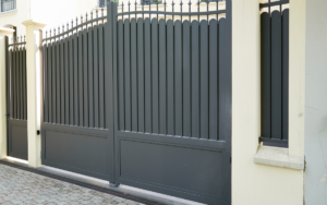
1. Metallic Charcoal
Metallic Charcoal is one of the safest but most refined choices for metal gates in 2026. It has depth, so the entrance looks solid, yet the metallic sheen keeps it from appearing flat or dull.
Where Metallic Charcoal works best
- Main gates for contemporary homes with straight lines and simple grills
- Compound gates for plots where the building is painted in light cream, off white or soft grey
- Security doors and boundary grills that should look firm but not aggressive
Good combinations with Metallic Charcoal
- Metallic Charcoal gate with off white or light beige boundary wall.
- Charcoal gate with Pearl White metal door at the pedestrian entrance.
- Charcoal grills on balconies with Beige wall surfaces behind.
Practical tips
- On very ornate gates, Metallic Charcoal softens heavy patterns and reduces visual clutter.
- It hides minor dust and marks better than flat black in strong sunlight.
- If the lane is narrow, this shade helps the gate recede slightly, making the frontage feel wider.
2. Metallic Peacock Green
Metallic Peacock Green is for entrances that should feel lively and individual. It picks up the tones of leaves and garden foliage, giving a house an immediate landmark.
Where Metallic Peacock Green works best
- Independent homes with trees, shrubs or lawn near the gate.
- Villas and corner plots that need a distinctive main gate.
- Smaller gates where a rich colour can be used without overwhelming the facade.
Good combinations with Metallic Peacock Green
- Peacock Green main gate with warm white walls and natural stone cladding
- Peacock Green gate with Beige compound walls and simple black hardware
- Metallic Peacock Green grills on balcony fronts with Pearl White window frames
Practical tips
- If the driveway is very short, keep nearby wall colours light so the green does not feel boxed in.
- Avoid pairing it with very strong wall colours such as bright orange or deep purple.
- A simple gate design with straight bars allows the colour to stand out clearly.
3. Metallic Pearl White
Metallic Pearl White gives metal doors and small gates a crisp, almost architectural look. It reflects light, which helps in narrow passages and shaded entries.
Where Metallic Pearl White works best
- Metal entrance doors in apartment corridors and basements.
- Side gates that open into courtyards or gardens.
- Inner faces of the main gates, where you want a bright view from inside the house.
Good combinations with Metallic Pearl White
- Pearl White metal door with Metallic Charcoal or Black frame.
- Pearl White pedestrian gate beside a darker main gate, so visitors can easily recognise the entry point.
- Pearl White grills complement soft grey or sand-coloured walls to create a light, airy feel.
Practical tips
- Pearl White looks best in places where dust and splashes can be cleaned regularly.
- On very busy main roads, consider using Pearl White only for upper panels and a deeper shade, such as Charcoal or Beige, on the lower portions.
- Use a neat, simple handle design. Heavy hardware tends to stand out strongly against white.
4. Glossy Phiroza Blue
Glossy Phiroza Blue has a bright but pleasant tone that gives a friendly character to gates and grills. It suits homes where you want the entrance to look approachable rather than formal.
Where Glossy Phiroza Blue works best
- Main gates of family homes on residential streets.
- Balcony railings and staircase grills that need a little color without looking busy.
- Doors to rooftop terraces, play areas or utility spaces.
Good combinations with Glossy Phiroza Blue
- Phiroza Blue main gate with light grey walls and Pearl White door frames.
- Phiroza Blue balcony grills above a ground floor finished in Beige and Charcoal.
- Phiroza Blue metal door to a terrace paired with a simple Black railing around the parapet.
Practical tips
- On very large double gates, use Phiroza Blue in panels and keep the frame in a deeper neutral, such as Charcoal or Black.
- Check the colour in both direct sun and shade before committing, as blues can appear very different across the day.
- Keep nearby garden elements simple. Too many strong flowering plants right next to this shade can create a restless effect.
5. Glossy PO Red
Glossy PO Red brings warmth and a sense of tradition to metal gates and doors. The glossy finish gives the colour a rich, polished appearance while the deeper tone keeps it solid and grounded.
Where Glossy PO Red works best
- Main gates of independent houses with tiled or sloping roofs.
- Entrances in older neighborhoods where a classic look suits the surroundings.
- Inner doors, such as those opening to courtyards or pooja rooms, where a warm tone feels appropriate.
Good combinations with Glossy PO Red
- PO Red main gate with cream or light beige compound walls.
- PO Red door with Pearl White frame and Charcoal threshold.
- PO Red grills against pale yellow or stone-textured walls.
Practical tips
- Use this colour carefully on very tall gates, as a large unbroken red surface can feel visually heavy.
- Repeat the shade in smaller elements, such as the nameplate border or planter stands, to tie the entrance together.
- On dusty roads, plan for regular light cleaning, since a glossy red surface will show dust and splashes more clearly than deeper neutrals.
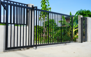
6. Matte Black
Matte Black is a long-term favourite for metal gates and doors, and it remains a key trend in 2026. The matte finish softens glare, adds depth and makes the details of the gate design easy to read.
Where Matte Black works best
- Nearly any style of main gate, from simple horizontal members to intricate patterns.
- Apartment complexes where uniform gates are required, but each building can play with wall colours and planting.
- Side and service gates that need to disappear into the background.
Good combinations with Matte Black
- Matte Black main gate with off white or light grey exterior walls.
- Black grills and balcony railings with beige or soft stone coloured surfaces.
- Black door frames with Pearl White doors for a clear, graphic look.
Practical tips
- Matte Black works very well with warm metallic hardware, such as brass or bronze coloured handles and hinges.
- In very hot locations, it can absorb heat, so it is sensible to provide a little shade or a planting strip near the gate.
- If your street is narrow, Matte Black visually recedes, making the frontage feel less cramped.
7. Matte Beige – calm, subtle and easy to maintain
Matte Beige is the quiet worker in this palette. It does not demand attention, yet it can pull together different elements of a facade in a very gentle way. It is also one of the most forgiving colours in terms of dust and minor stains.
Where Matte Beige works best
- Compound gates on busy streets with a lot of dust and traffic.
- Houses with strong wall colours, where the gate needs to play a neutral supporting role.
- Grills and staircase railings inside the compound, especially where children are likely to touch the surfaces often.
Good combinations with Matte Beige
- Beige gate with white or light cream walls and a Charcoal or Black base course.
- Beige grills with Phiroza Blue doors or shutters, to keep the overall view balanced.
- Beige inner gates with Pearl White doors inside the house.
Practical tips
- Beige is ideal if you prefer to repaint less often, as it shifts gradually and evenly as it weathers.
- It is a good choice for rental properties where you need a neutral look that suits many types of tenants.
- You can use it as a transition shade between intense colours, for example, Beige grills between a PO Red gate and a bright wall inside.
If you are looking for the exact shades, here are the corresponding shade codes from MRF Vapocure Paints:
| S No | Shade code | Shade name | Finish |
| 1 | 12 | Charcoal | Metallic |
| 2 | 24 | Peacock Green | Metallic |
| 3 | 831 | Pearl White | Glossy |
| 4 | 142 | Phiroza Blue | Glossy |
| 5 | 514 | PO Red | Glossy |
| 6 | 600 | Black | Matt |
| 7 | 406 | Beige | Matt |
Common Mistakes to Avoid with Metal Door and Gate Colours
Even a good shade can look wrong if the planning is weak. Watch out for these points.
- Too many strong colours together: If the walls, gate and grills all compete, the eye has nowhere to rest. Let one strong shade lead and keep others neutral.
- Ignoring the road width and surroundings: In very narrow lanes, very bright colours can feel oppressive. Deeper neutrals such as Charcoal, Black or Beige work better there.
- Not checking colours in real light: Always look at a test patch in morning, noon and early evening light. Metallic and glossy finishes, in particular, can shift strongly throughout the day.
- Using high gloss on surfaces that catch constant dirt: Gloss can look beautiful, but on the lower half of a gate next to a busy road, it may demand frequent cleaning. In such cases, opt for matte finish.
MRF Vapocure Paints: Colours for Every Wall, Gates, Grills & Balcony Railings.
MRF Vapocure Paints offers a wide choice of shades for every part of your home, from soft interior wall colours to bold exterior finishes that stand up to sun and rain. Our interior wall paints come in a broad palette, so you can match living rooms, bedrooms and kitchens to the mood you want in each space.
For exteriors, we provide durable colours that keep facades fresh and welcoming even in demanding weather. Metal surfaces are equally well served, with finishes designed for gates, grills, doors and railings so that protection and appearance go hand in hand. Whether you are repainting a single room or planning an entire building/home, you will find coordinated options across interior walls, exterior walls and metalwork, all under one roof.
Summing Up
Metal doors and gates stay in place for many years, so their colour should be chosen with more care than a quick coat on an interior wall. When you look at the facade as a whole, think about light, dust and maintenance, and then work within a clear palette, the entrance immediately feels more deliberate and welcoming.
The seven shades in this blog cover most real situations. Metallic Charcoal and Metallic Peacock Green make strong, modern statements. Pearl White and Phiroza Blue bring light and freshness to doors and grills. PO Red, Black and Beige offer warm, timeless options that are easy to live with and simple to maintain.
FAQs
1. Which colour is best for a metal main gate in 2026?
For most homes, Metallic Charcoal, Matte Black or Matte Beige are the safest long-term choices. They work well with a wide range of wall colours and handle dust well. If the facade is simple and the surroundings are green, Metallic Peacock Green is an excellent statement option.
2. Are black metal gates still in style?
Yes. Matte Black remains a strong trend. It has a timeless look, hides shadows and details well and pairs easily with both warm and cool wall colours.
3. Which shades work best in hot, dusty cities?
Metallic Charcoal, Matte Black and Matte Beige cope best with dust and temperature swings. Very light glossy shades, such as Pearl White, can still be used on upper panels or doors, provided routine cleaning is possible.
4. Can I mix more than one of these colours on a single gate?
You can, but keep it controlled. For example, a main field in Metallic Charcoal with vertical members in Metallic Peacock Green, or a Beige gate with a Phiroza Blue central panel. Too many divisions in different colours quickly look busy.
5. How often should I repaint a metal gate or door?
In normal city conditions, a well-prepared and properly coated metal gate should hold its colour and protection for around 5 to 7 years. In coastal or highly industrial areas, it is advisable to inspect the surface annually and plan a repaint roughly every 3 to 5 years, especially if you notice chalking, rust spots, or peeling near welds and corners.